A new series offers some highlights of the epic roadtrip down the coast of California and over to Arizona and back to Oregon via Palm Springs – over two weeks of the holidays. These won’t be in any particular order – just grabbing what grabs my attention when sifting through photos.
deYoung Museum – San Francisco
A highlight indeed, and on my list of desired destinations, was the deYoung Museum in San Francisco. Located in Golden Gate Park, the museum building was designed by Herzog & de Meuron with landscape architecture by Walter Hood.
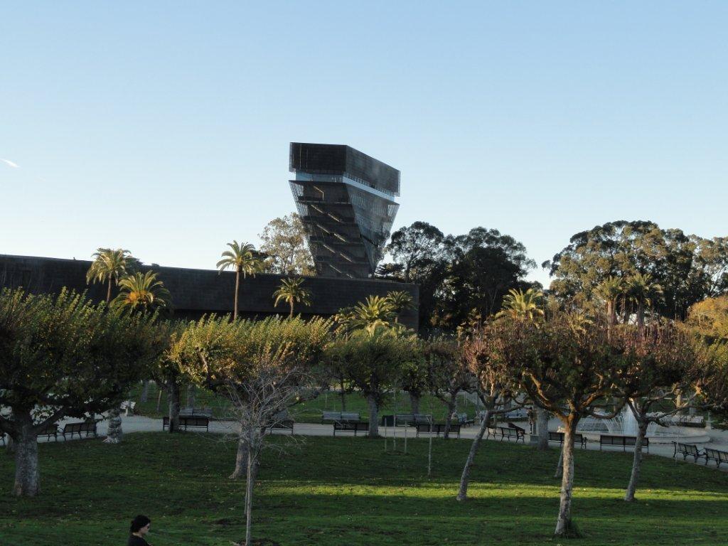
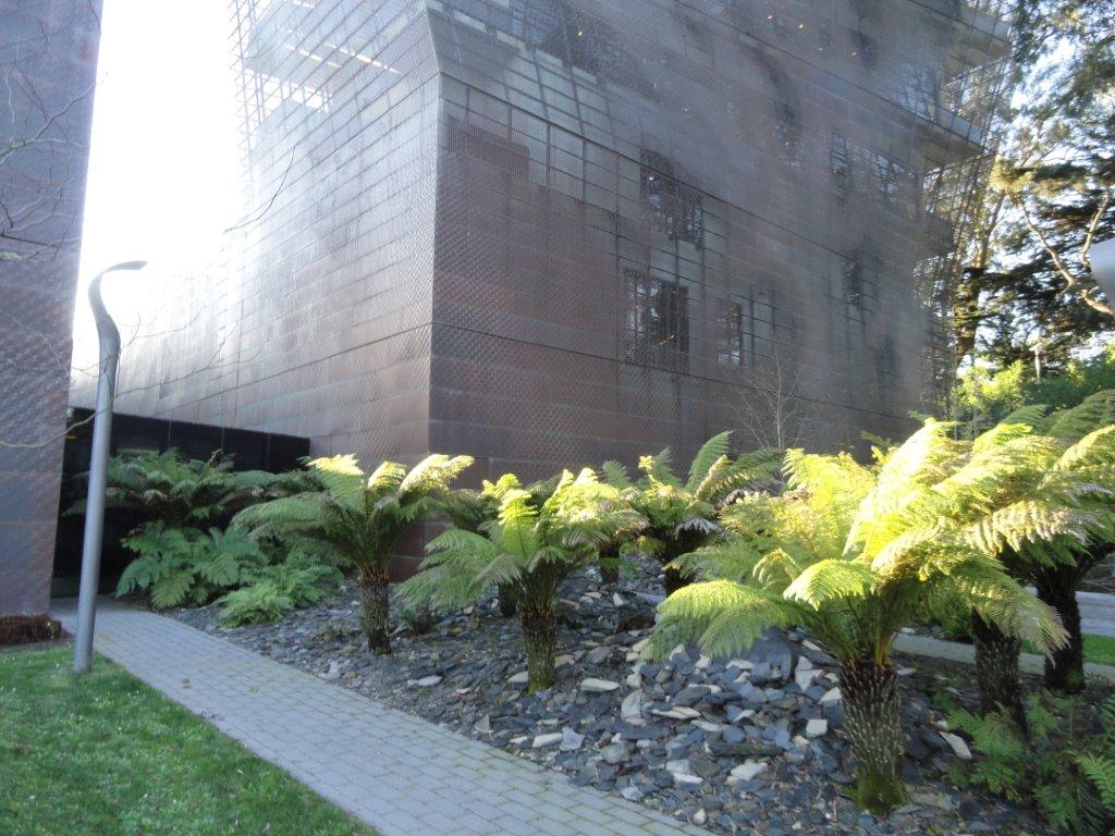
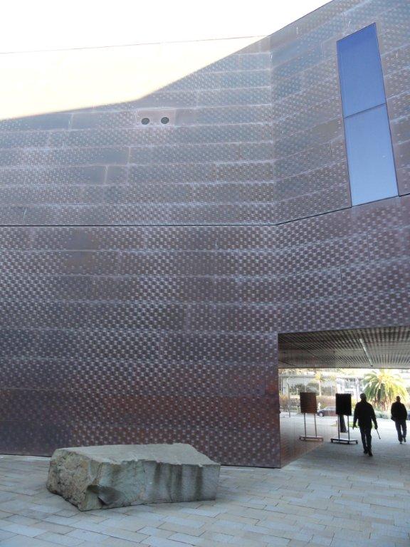
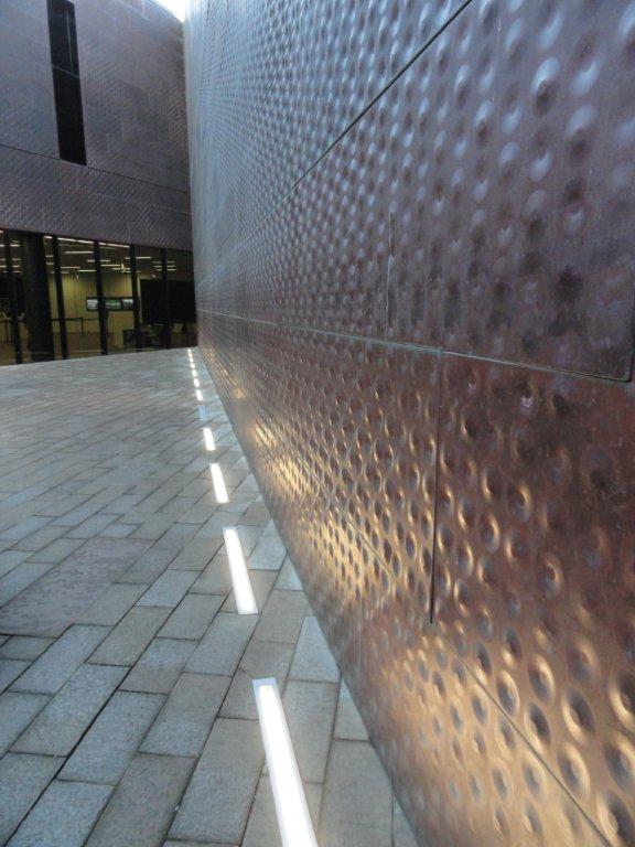
Most notable is the exterior cladding, which as we approached from behind the building, made for a very sci-fi type of form when approaching the tower. I could spend hours on the cladding alone – which to me becomes as important of a landscape feature as the site work – due to its texture and mutable materiality.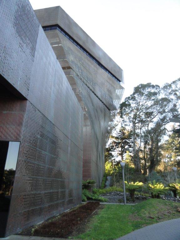
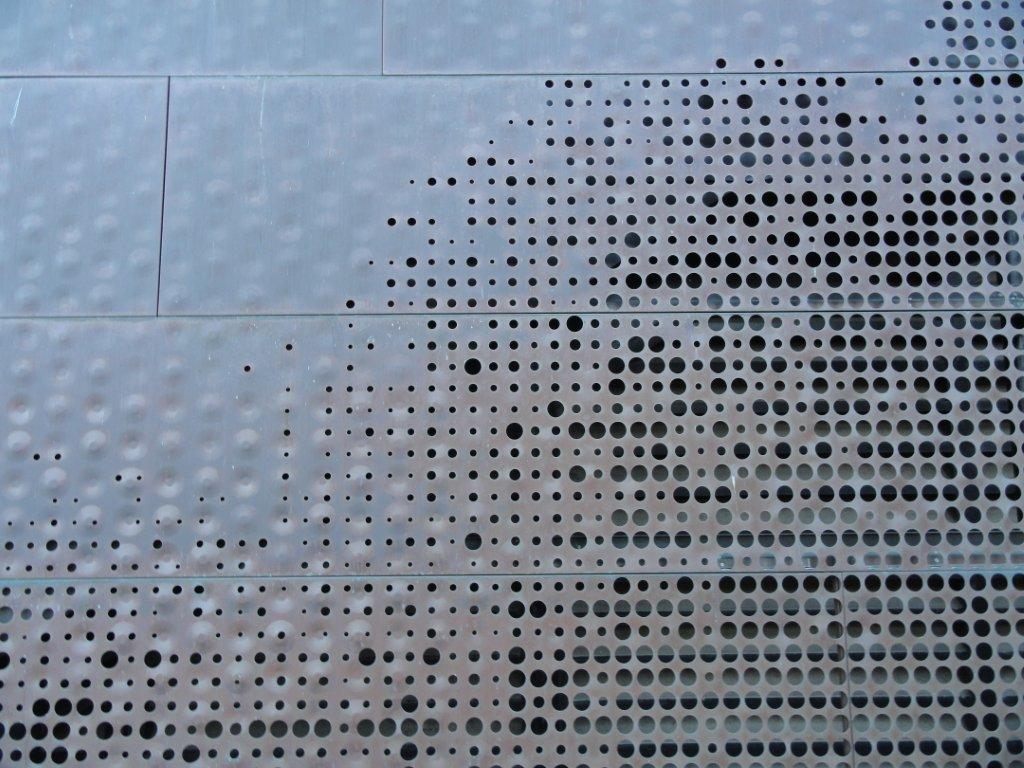
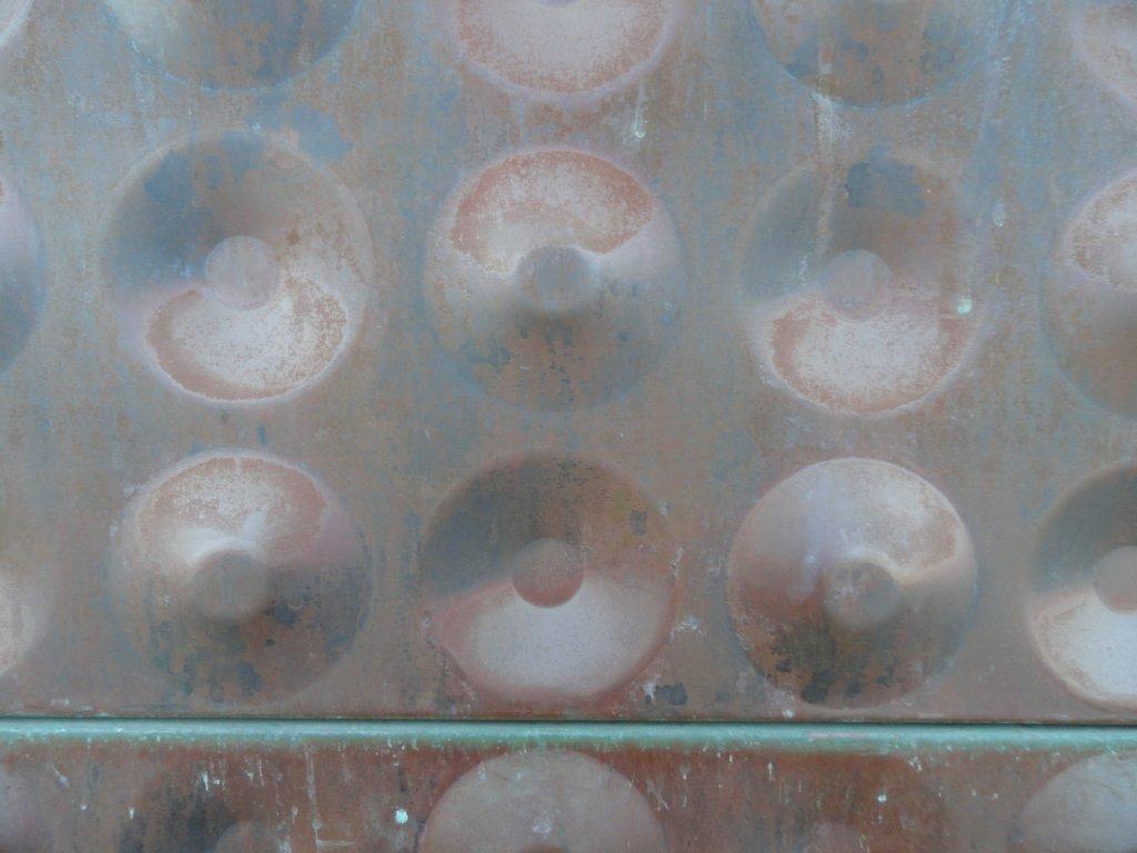
The rhythm of inside and outside bumps offers a soft skin, which is punctuated at times with a grid of varying circles, which provide porosity to the skin and make what could have been a monolith more light. The copper lends itself to changing through oxidation to create a patina.
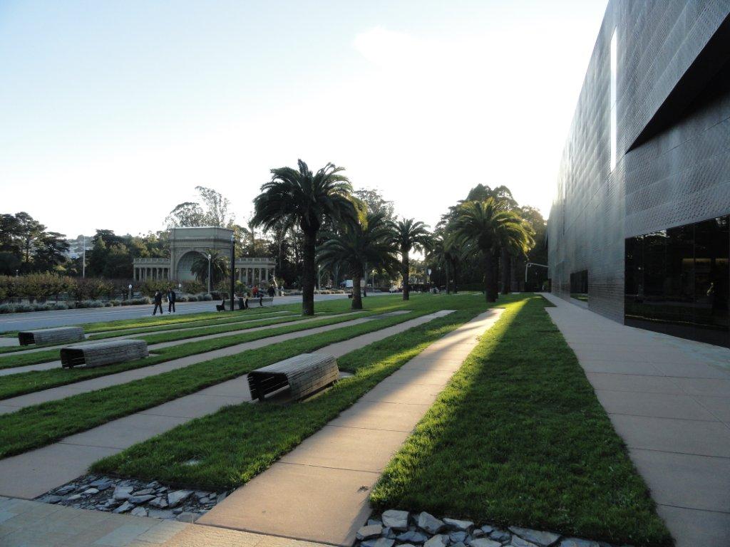
The greater site landscape itself is not trying too hard – but does a fair job of buoying the building in a minimalist scheme and creating some comfortable pockets of respite. The goal isn’t for a landscape of flash – but one of restraint, and Hood performs this task with alternating bands of concrete and lawn, with a few moments of more verdant foreground. The path right next to the building, which i find often disconnects building from site (the modernist floating structure) in this case allows one to get close to the copper cladding.
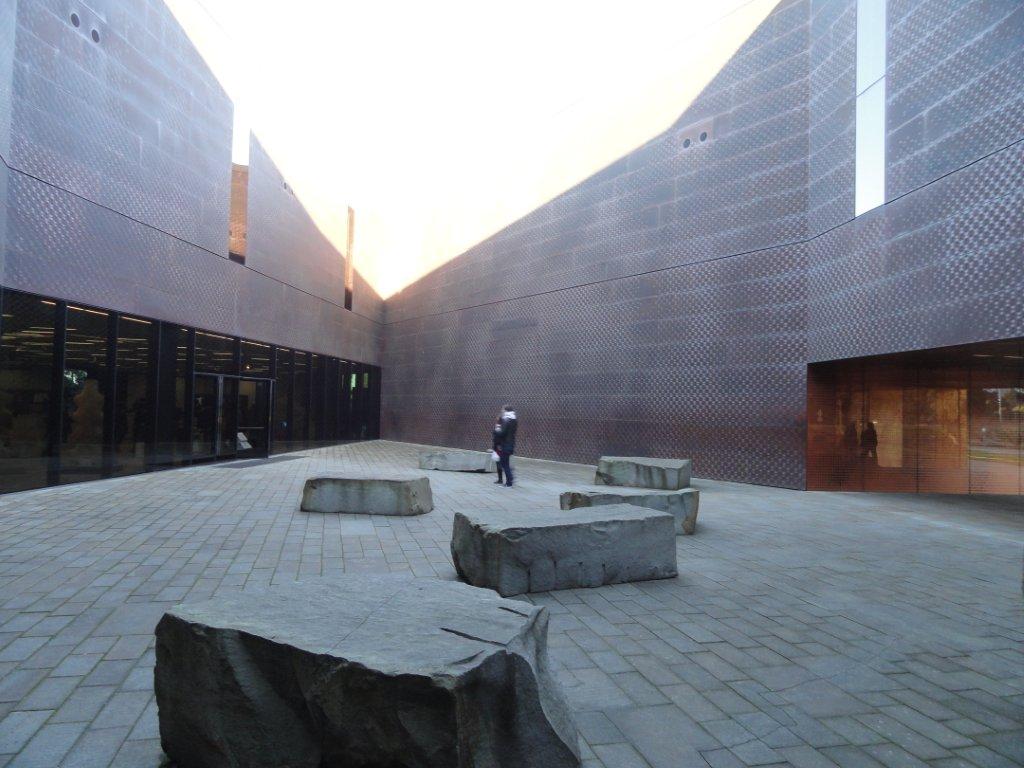
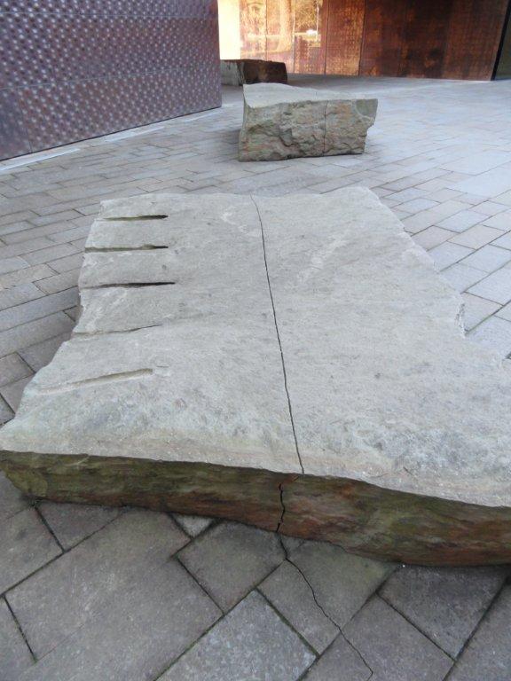
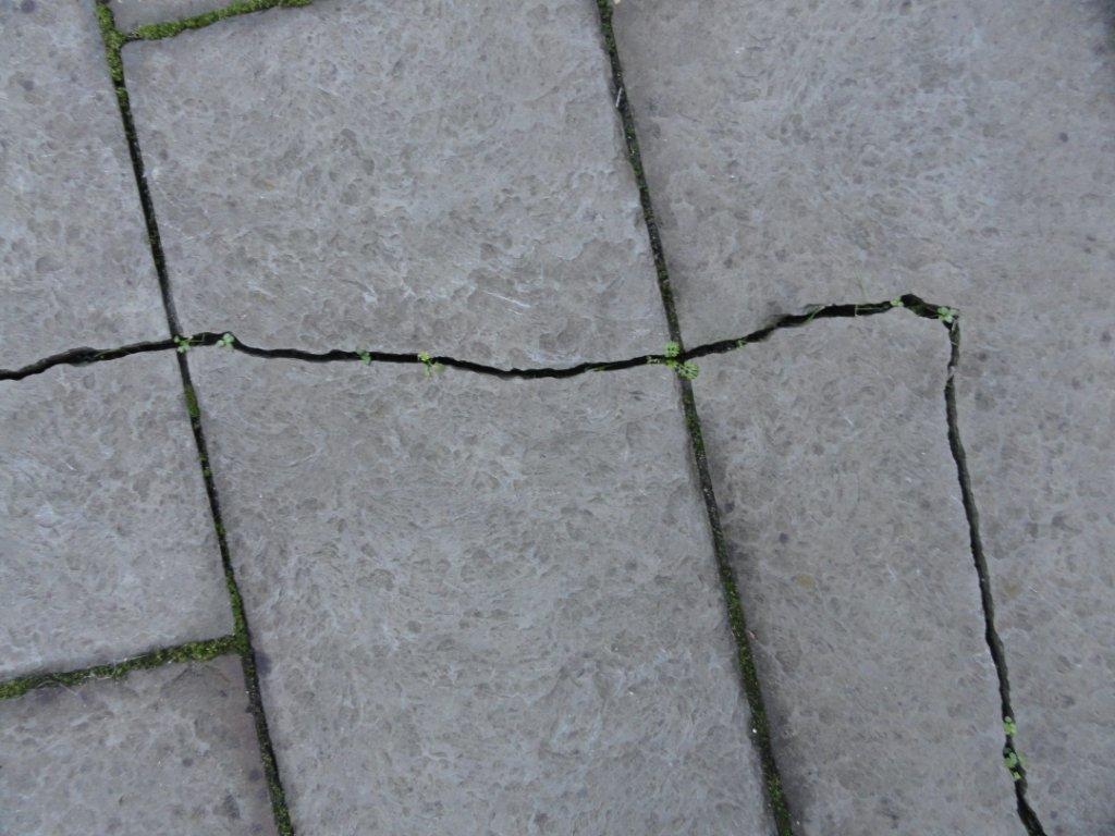
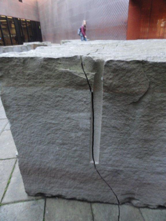
The highlight was the amazing entry installation called ‘Drawn Stone’ by Andy Goldsworthy, which is a subtle tracery that zig-zags and flows through the open courtyard space – a fine crack that connects through sandstone pavers and continues unabated through imported stone slabs to create a disparate yet connected composition of forms throughtout the space. With very little, the space feels very complete.
Inspired by the ‘techtonic topography’ per the signage, the earthquake faultline metaphor could have been a bit heavy handed, but i didn’t think of it until i read the words – which means it can connote different possibilities. As Goldsworthy mentions: “Stone and people making the same journey is for me a powerful expression of movement and of the great upheavals and displacements that have occurred to both.”
I’m not normally a big fan of these austere minimalist spaces – but the texture of walls and the layout of elements makes this work. It’s not a place to linger and zone out, but perhaps more to explore and hone in on the immaculate detailing. Guess that could be the takeaway for the whole building.
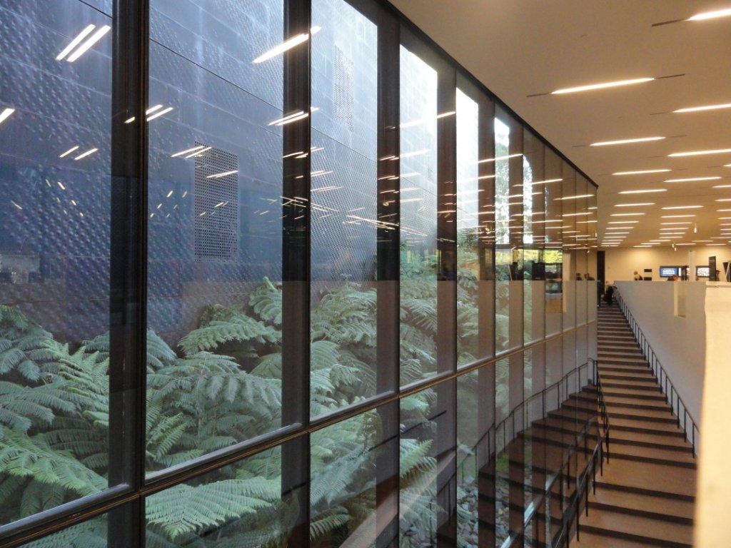
The interior spaces offer some spots of greenery, such as this shaftlike courtyard of ferns, which softened a bit of the angularity of the interior.
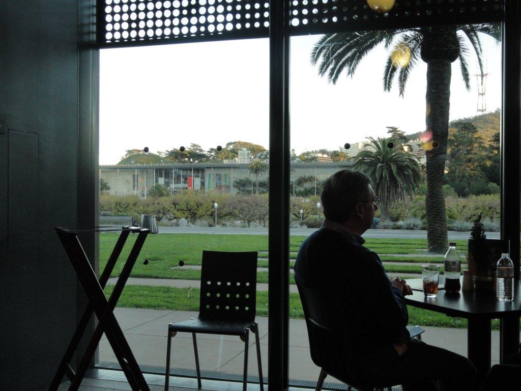
As the museum was closing, we didn’t tour the exhibits, but stopped for some refreshment in the cafe – which overlooked the central plaza garden. Oh, wait, what is that right across the street…?
Coming soon…
One thought on “Field Trip: deYoung Museum”