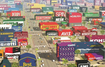
:: Logorama by H5 – image via Designboom

:: (color plate from the book)
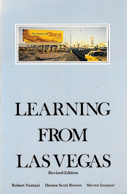
It is one of those books that everyone should read at some point, so I finally got around to sitting down and busting through the entirety of my copy of Learning from Las Vegas by Venturi, Scott-Brown and Izenour. Strangely enough, it was a disparate context in which this reading occurred, sitting in the backyard of my relatively pastoral house in Portland, drinking cold Miller High Life in a bottle, smoking cigarettes, and watching chickens run between by legs picking at the detritus on the ground around me. Pretty far from the bright lights of the Vegas strip – particularly the version of it that existing in the late sixties when the famous studio regarding to ‘The Great Proletarian Cultural Locomotive.”
(all images from the book)
I don’t aim to summarize the book here as much as to reflect on the relevance of the text to our time. The opening essay ‘A Significance for A&P Parking Lots, or Learning from Las Vegas’ is what I consider the best part of the book – and should be widely read. A version of JB Jackson’s modern anthropology through the lens of ego-driven architects, it’s some hyperbolic prose that is worthy of the city in which it is directed.
What it does do is incent the architect or planner to look at the context and consider it in design, which was mostly a reaction to the predominant modern tendency of the time, that of the Modernism. As stated in the opening page: “Modern architects work through analogy, symbol, and image – although they have gone to lengths to disclaim almost all determinants of their forms except structural necessity and the program – and they derive insights, analogies, and stimulation from unexpected images.” (p.3)
While this way of looking acknowledges this historicism and allows some guidance to interpreting the present. In the case of a reference to Nolli maps and the idea of using a graded figure ground to provide more detailed information about the sites nuances – for instance the powerful imagery of the Roman piazza and the more subtle blending of interior (private) and semi-exterior spaces (quasi-public). A modern take on this realizes the idea of the piazza as the open expanses of parking lot, and the casinos as quasi-public space that spills out and engages the street.
One aspect of the book that is fascinating is the interesting graphic representations that are both of a particular time – but somewhat timeless in their simple composition of ideas and context. It seems like there are a number of re-interpretations of this style and I think it’s a pretty good reference point. This is particularly relevant to landscape architecture which (albeit often for good reasons) often uses color as a crutch, and seems stuck in a graphic vocabulary that hasn’t changed much in twenty years – particularly in relation to site analysis.
One of these powerful images is the analysis of the strip in terms of the words that one sees when moving through the corridor… done old school – but something that could be rendered using new media methods such as flash animation to provide simple yet effective tools – maybe allowing a user to move along the roadway and showing the relative visual power of the various icons based on location and distance.
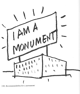
The books strength is its look at the cultural aspects of the city as generators of form and the context driven approach, and seems to wander in the final portions to include too much editorializing and WAY too much use of the work of Venturi to illustrate points. (Sorry fans of Venturi, but most of that work isn’t merely ugly and ordinary in a poetic sense, but just plain bad). That’s not to say they aren’t a good counterpoint to the modern brutalism that it is juxtaposed against, but there could be some better work to use rather than the Guild House and the Columbus, Indiana Fire House No. 4.
The polarizing rhetoric of ‘yes’ vs. ‘no’ actually works well in Las Vegas, where the context and use is so out of whack with reality that what seems real is actually wrong and what seems overly wrought is actually perfect. The lexicon of ducks and decorated sheds have persisted and should be studies for reuse in our mindless strip development – because it at least offers some authenticity that is sorely lacking in the suburban strip development that many people exist throughout.
Additionally, on representation, the idea of a strong visual is often metered with a number of comparative lists (for instance the image below analyzing urban sprawl vs. megastructures and finding both lacking somewhat). These are really interesting studies – and would actually be a great tool for theory to provide a quick brainstorming that gives some interesting point/counter-points… each of which could be explored in detail (click on the image below to see it larger).
While the lists are dense with information, it’s often the visuals that show these dichotomous relationships within Las Vegas the most – as in the mixing of derivative classicism with modern motile necessity.

While it was definitely worth a read (especially amidst the contextual opposite of the backyard farm) the first half of the book is much more worthwhile than the second – particularly when read today. The ideas of looking and learning from something that is more often than not dismissed as non-architecture or anti-urban is a necessity for anyone working in these fields. More urban than landscape (at least in a literal sense) the idea of signs, symbols, and communication within our urban realm makes for a lesson that this book still seems valid – and worth taking a look.


Very good post with a lot of beautiful pictures. Keep up the good work!
landscapers las vegas