If you love maps, not as just as visual artifacts but as part of design and planning methodology, Nadia Amoroso’s recently published ‘The Exposed City: Mapping the Urban Invisibles‘ (Routledge, 2010) will validate, comfort, and quite possibly amaze you. That’s the effect it had on me – after quickly devouring this visually rich resource – I was full of ideas on representation and new uses for maps as valuable tools for urban studies, planning, and design.
While ostensibly advertised as a book on planning and geography, ‘The Exposed City’ offers a much broader natural extension of traditional static mapping as a tool for urbanism. Taking a number of historical precedents and new technologies, Amoroso looks at the vast amount of complex information that is collected and exists for urban areas and asks a simple question: “If a city was able to be defined by these characteristics, what for would it take? How could it be mapped?”
Mapping today is a common and accessible exercise (with hoards of of historical precedent to boot). Many designers work in GIS, have available digital tools and online maps, and get access to information that is often employed for diagrammatic purposes, utilized for a neo-McHargian overlay mapping. Most designers are familiar with a range of mapping techniques – but this book will challenge your concept of what you consider a map and how these may inform your work. The concepts in the book look at ‘maps’ of the urban invisibles – that information perceived yet hidden away in data sets – as a new opportunity for designers. The books thesis is regarding maps per se, but specifically “…the role of maps as both presentational results as aesthetic objects and informative tools, which could be used to influence architectural, landscape architectural and urban design moves.” (p.xi)

:: Nolli map – image via @rchitecture
In short, the book moves through the work of Hugh Ferriss, who developed amazing graphic interpretations of buildings using the 1916 New York zoning ordinance, touches of the more well known work of Kevin Lynch (Image of the City), Richard Saul Wurman (Understanding USA), and visual communication guru Edward Tufte (Envisioning Information), satirically provocative MVRDV/Winy Maas (Datascapes), and finally trend-setting landscape architect James Corner (map-drawings). Together these actors outline a methodology of data-mapping that offers many potential expanded opportunities for architects, landscape architects, and urbanists to generate, represent, and develop data-driven visions for a range of issues.
Instead of going into massive detail (which Amoroso does nicely and which from reviewing my notes would take multiple posts) I thought I’d give a few snapshots that resonated with me, and leave it for you to discover all of the rich content and leads outlined within. Trust me – get the book – it will give you plenty of ideas and fodder for discussion and thought, whatever problem, scale, solution, or design you make be working through.
I was immediately struck in Chapter 1 by the work of Hugh Ferriss (which was 100% new material to me) and his amazing three-dimensional renderings of urban potentials based on complexities of codes – specifically crunching the zoning codes of 1916 to create ‘potential scenarios’ that gave developers ideas of how they could maximize buildings within the existing parameters. In the following image, the graphic evolves from a massing study, gaining articulation, fenestration, and finally a realistic potential urban massing. The result is not a building, but a “…sculptural impression of a completed design for a skyscraper in which the careful arrangement of the masses in accordance with the legal and economic measures of zoning ensures the building’s practicability.” (p.14) Or, simply, a map.
:: Evolution of the Set-back Building – image via the/hectic/interlude!!!
Our historic perceptions of the stylistic architecture of the 1920’s may lead us to see a common building form in these drawings, but at the type of architecture at the time was quite revolutionary (a collection of his work is titled ‘The Metropolis of Tomorrow’). These drawings provided a blueprint for many architects and developers of the time – meaning the ‘maps’ influenced the future urban form: “Indeed, as the new breed of towers began to rise, Ferriss’s moody drawings of their mountain-like masses, terraced setbacks and soaring pinnacles proved as crucial as any built work to setting the tone for New York’s super-charged urbanism of the 1920’s” (p.31)
:: image via Artect
In addition to outlining the early role of the ‘renderer’ in early architectural work (which has evolved, but to tell you the truth graphics say a lot, even with modern architecture). Ferriss shows the power of the pencil (or charcoal) in translating complex data into visions of urban form.
This idea of drawing and graphic representation is the crux of Chapter 2 – a mixed bag incorporating the work of Lynch, Wurman, and Tufte that investigates “…the use of diagramming and mapping as a means of simplifying the complexity of urban flux (changes in urban form, i.e. the development of parks, streetscape, new buildings, etc.) in essence to review the complexities of the city.” (p.41) Most of these works are well-known and taught at many universities, so a quick overview will suffice.
As mentioned in the text, Lynch used mapping to draw out the ‘imagability of the city‘, which “…is the quality embodied in a physical object that gives it a high likliehood of generating a strong image within a given observer.” (p.42) While the resultant produced drawn line drawings are compelling on their own, they are even more powerful when compared to each other to showing perceptual differences between individual memory maps, field sketches and what this means for urban form and potential markers to influence the evolution of our mental maps.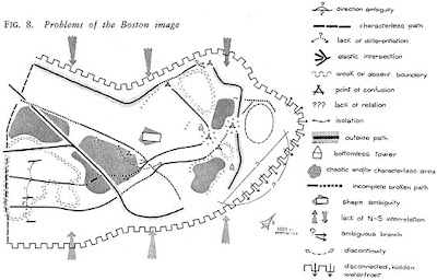
:: Imageability Mapping (Lynch) – image via CSISS
While Lynch gave us a much-used urban vocabulary of paths, edges, nodes, districts, and landmarks which has persisted in use in mapping for planning and design, the work of information architects such as Wurman investigate the ability to graphically represent massive or complex sets of data – whether urban or merely statistical. In Wurman’s view, the map is essential: “You cannot perceive anything without a map. A map provides people with the means to share in the perceptions of others. It is a pattern made understandable; it is a rigorous, accountable form that follows implicit principles, rules and measures. Maps provide comfort of knowing in that they orient us to the reality of place.” (p.57)

:: Understanding Demographics (Wurman) – image via Architectradure
Wurman’s work encompasses a range of disciplines – some not specifically urban, but all relevant. His more recent work takes it back to global urbanism with the 19.20.21 project, a study of 19 cites, with 20 million people in the 21st century, which will “…focus on globalization patterns and explanations that will become key tools for mapping and understanding our future city.” (p.59) Switching scales dramatically, Edward Tufte has been imminently influential in a new focus on visual communication, stating that “…the packaging of information is something that ultimately determines how much is accepted and used by other individuals.” (p.60)
This focus on graphic legibility isn’t necessarily ‘mapping’ but is more focused on the means and methods of delivering information. In this case, Tufte is best known for amazingly complex but clear drawings using rules (i.e. integrity of scale, appropriate color schemes, correct proportion, and elimination of ‘chartjunk’) used rigorously to display information. Somewhat in conflict with the more abstract creative aspects (shown in upcoming topics) these data rules are essential to understand and achieve “clarity, correctness, and coherence“… something we should all strive for in any graphic communication.
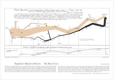
:: Napoleon’s March (Tufte) – image via Edward Tufte
Chapter 3 includes exploration of the work of Dutch firm MVRDV, particularly their groundbreaking planning studies “…using data to generate alternative urban and architectural forms and as a means to help guide planners to urban design decisions.” (p.68). Implied as plausible fictions, these graphics crunch available numbers into a ‘statistical description‘ making ‘datascapes‘, or abstractions of physical, social, cultural, and environmental features in graphic representations.

:: China Hills Datascape – image via arqa.com
Not solutions per se, these graphics merely outline “…the maximum limits within which the architect can produce his designs.”, providing a touchstone to potential decisionmaking. . The absurdity of creatively generating data, then using “…architectural autonomy to impose ‘expert’ authority, that is, the architect plays a part as the director of political powers in design.” (p.70) While there is some debate about the overall relevance, as a tool for urban exploration of ideas these datascapes are a work of pure genius, in particular in works such as Pig City – which take scenarios and create actual spatial configurations that satirize concepts of growth, localism, and realities of scale – provoking dialogue and debate.

:: Pig City – image via Archilogy
This concept, and the bulk of the chapter, references the amazing ‘Metacity/Datatown‘ which ought to be required text for any budding urbanist, at least in terms of new methods of analysis and representation. In a nutshell, the premise involves quadrupling of the current population of the Netherlands, portrayed in a range of visual ‘scenarios’ encompassing living, agriculture, CO2, energy, waste, and water consumption. These concepts could yield dull and dry map objects, but instead focus on ‘extremizing scenarios’ that “…takes a leap in regards to mapping conventions by visually documenting the urban consequences spatially and by providing a potential new urban form.” (p.72)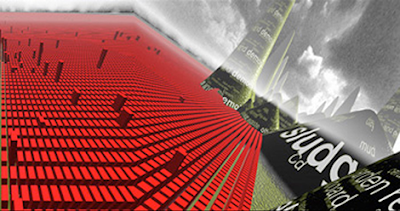
:: Datatown – image via Serial Consign
One example above uses an abstraction (red boxes for areas of habitation) juxtaposed with graphic representation of other materials, in this case waste “…such as household products, dredging sludge, vehicle wrecks, hazardous waste, office products and waste from construction and demolition. These amounts emerge as hills an mountainous forms, which create a new landscape.” (p.80). The chapter ends with an interview with Maas, summed up in the following quote:
“Datascapes give a more mathematical answer towards the complexity. The second component, which was surrounding meta (data types and kinds), deals with larger urban processes that became more relevant in the practice again. Architects, like me, were only dealing with objects. There was a need to redefine architectural object through some meaning in an urban and larger format, and urbanism deals with issues of numbers and statistics and of course larger sclaes, more than the individual.” (p.88)
Chapter 4 get’s into Corner’s map-landscapes (best captured in the book ‘Taking Measures Across the American Landscape” w/Alex Maclean)… are a hybrid of maps and drawings: “…a combination of map and drawing styles such as collage crafted by Corner as a means to interpret the aerial photos, and thus, creating a map-drawing of the site.” (p.94) Less specifically data driven, these maps are aligned closely with operational practices in landscape architecture, a blending of the creative and the technical. Getting out of the typical uses in design and planning – the concept is that mapping loses power with mere tracing or analysis, but instead “Maps present… an eidetic fiction constructed from factual observation. As both analogue and abstraction, then the surface of the map functions like an operating table, a staging ground or a theatre of operations upon which a mapper collects, combines, marks, masks, relates and generally explores” (p.100) That ‘fiction’ is where creative ideas come from.
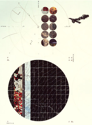
:: image via Pruned
Amoroso also links these mappings with the field of landscape urbanism, connecting the ideas of change, temporality, and movement – embedding this in a typically static medium. Regarding LU: “…it is the potential mapping capability and visual representation of this new discipline that is most appealing. Landscape urbanism can be summed up as an arresting medley of landscape techniques. These include mapping, cataloging, triangulating, surface modeling, managing, phasing, layering and others – which can also be combined with urban design techniques such as planning, diagramming, assembling, allotting, zoning, etc. – to broaden the visual palette of the mapping field.” (p.107)
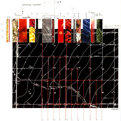
:: image via Pruned
The book outlines much of this early work, along with an interview with Corner that touches on many of the methods – including formative inspiration from McHarg, the connections between landscape and maps, and new avenues for research – all with Corner’s trademark verbosity… An excerpt: “…I believe another body of research should look at how maps are inevitably cultural contstructs, not simply inert rational data banks, but active diagrams that extend a certain agency over how the world get’s shaped. Artists and conceptualists are good at seeing maps in this way, not so much as informational devices, but as performance stages that can critically script certain spatial geographies in fresh ways.” (p.112) These mapping techniques show up in some of Corner’s later work in competition entries and diagrammatic mappings for such projects as the High Line and Fresh Kills – showing the progression of this method in practice.
A summary of the intent is mentioned in the foreword by Richard Saul Wurman Amoroso makes the connections from Hugh Ferris, to Edward Tufte, James Corner, Kevin Lynch and MVRDV’s datascapes – creating maps as: “…statistics through time, the visualization of changing complex data that allow one to see the things they’ve always seen but never seen…”, and utilizing “…map-landscapes…as the preeminent way of organizaing and understanding complex data relative to demographics, marketing, the environment, traffic patterns, as well as the less romantic descriptions of crime and unrest.” (p.viii)
The final section discusses some new tools (such as Google Earth) and the work of the SENSEable City Lab at MIT, which is worth checking out for their uses of sensors to develop new maps of invisibles. From their site: “The real-time city is now real! The increasing deployment of sensors and hand-held electronics in recent years is allowing a new approach to the study of the built environment. The way we describe and understand cities is being radically transformed – alongside the tools we use to design them and impact on their physical structure. “
:: image via SENSEable City Lab
The bulk of this final section investigates a number of new ‘map-landscapes’ by others and created by Amoroso – inspired by the sum of precedents contained in the first four chapters. While the whole point is there aren’t rules, she does outline a number of useful strategies for generation of map-landscapes gleaned from the precedents and studies – worth including:
- Treat data as spatial representations
- The visual representation of data is related to the numerical representation
- Use the data as the palette to guide the form
- Use effective artistic licenses
- Dramatize the data
- Choose an appropriate method or representation
- Apply more lighting to emphasize larger quantities or points of interest in the data
- Select the most telling viewpoint to profile the map-landscape
- Visually represent the overall communicative message
The precedents and examples in ‘The Exposed City’ showcase an old/new method of using mapping techniques to display information in ways that can inform new processes such as landscape urbanism and complex urban planning and design. The ability to capture and reuse the myriad data in the world not just for analytical means, but with the interweaving of art and urban theory, gives designers new tools for representation and understanding of the complexities of the urban condition.

great overview.inspiring and informative!thanks 🙂