Serendipitously continuing on the topic of mapping, some interesting ones (spotted on Seattle’s Publicola) offers many color-coded maps of racial diversity from major US cities. The work is from a familiar name, Eric Fischer (an earlier post showing some of his work is here), and he has developed another comprehensive set of urban maps highlighting diversity (or in these Pacific Northwest versions, an inherent lack thereof). As a simple key racial groups are generalized as such: “White is pink; Black is blue; Hispanic is orange, and Asian is green.”
The map of Portland (top) with associated demographics (7 percent black, 6 percent Asian, 7 percent Latino)… outlines the ‘white’-ness of the area – even compared with still very white Seattle (bottom) – (8 percent black, 6 percent Latino, 14 percent Asian).

:: Portland – image via Publicola (link direct to Flickr)

:: Seattle – image via Publicola (link direct to Flickr)
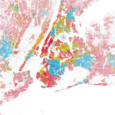
While pretty, it’s much more interesting when you see a more diverse urban area, in this case New York City which comes alive with a diversity equal to their role as melting-pot of the United States.

:: NYC – image via Publicola (link direct to Flickr)
From Fischer’s Flickr pool, some explanation: “I was astounded by Bill Rankin’s map of Chicago’s racial and ethnic divides and wanted to see what other cities looked like mapped the same way. To match his map, Red is White, Blue is Black, Green is Asian, Orange is Hispanic, Gray is Other, and each dot is 25 people. Data from Census 2000. Base map © OpenStreetMap, CC-BY-SA” Rankin’s map has a slightly different color scheme, as noted, but I think is doubly powerful due to the overlay of actual neighborhood boundaries – which could be added easily to any of Fischer’s maps above on a case-by-case basis.

:: Chicago – image via radical cartography
As explained by Rankin on the site: “My alternative is to use dot mapping to show three kinds of urban transitions. First, there are indeed areas where changes take place at very precise boundaries — such as between Lawndale and the Little Village, or Austin and Oak Park — and Chicago has more of these stark borders than most cities in the world. But transitions also take place through gradients and gaps as well, especially in the northwest and southeast. Using graphic conventions which allow these other possibilities to appear takes much more data, and requires more nuance in the way we talk about urban geography, but a cartography without boundaries can also make simplistic policy or urban design more difficult — in a good way. “
Just as mentioned in the previous book review, displays of information are just one way of looking at data – but by using these maps as geographical and comparative case studies, it’s a macro-level view of 1) racial diversity in general and 2) how this is referenced in specific locales in the urban area, and how this changes/evolves over time. It would be interesting to see more detailed demographic categories, updated with 2010 census information once it is collated… which I’m guessing someone is already thinking about…
these are awesome. i love them just as works of art.
ps. we’re having a giveaway. we’d love for you to stop by: http://www.faucethead.com/blog/?p=1208
This makes me rethink what people mean when they say that NY and other places are more racially diverse and accepting. I’d always assumed that that meant that you had people of many cultures living in the same neighborhood, but apparently not.
Seattle may not have a large minority population, but at least we no longer have particular streets dividing races from each other.
Hopefully the new census data shows more blurring of edges.
are these randomly generated dot density maps from census data? If so, they are misleading because they give the impression that these are actual locations of people of different races, when they aren’t.
If you actually have point locations of racial data, that’s another story.
Uhb. I’m not clear what methodology was used, but perhaps a question for Mr. Rankin or Fischer. I agree that the map (much like many representations) is not accurate – but I think there’s some merit in a comparison (using similar methods) between cities themselves. The basis on consolidated census data is limiting to start. Does anyone know if it’s even possible to gather point location of racial data – through other means such as home ownership, etc. It seems as if no one is collecting the info, then it’s hard to use it appropriately.
A more useful (if less artistic) tool in Portland at least is our great Regional Equity Atlas, which maps and analyzes a number of local equity issues to a much more detailed level of specificity… although most of this info is gleaned from census data as well. More on this soon.