I received a little gem of a book from Oro Editions entitled Austere Gardens: Thoughts on Landscape, Restraint, & Attending. Written by Marc Treib, the book (at a slim and image-heavy 100 pages) is a meditation of a sort. Having been immersed in some much heavier reading recently, I sat down and absorbed (reveled in?) this book in one sitting, and it was a breath of fresh air in contrast to much more academic writing.
The word garden means implies form-making, so Treib contrasts the Edenic model, which aims “… to surpass our given environment in abundance and delight,” in contrast to that of simple “…landscapes of reduction and compression,” (10) which embody the idea of the Austere.
From the publisher’s website, a bit of the background:
The word “austere,” as used in this essay, does not imply asceticism, but merely modesty and restraint. Austere landscapes may first appear devoid of interest if noticed at all. To those who do not look beyond their surfaces, these sites, and the world outside them, usually appear plain and uninteresting, or even lacking of the very properties by which we define a garden. But there are sensual, aesthetic, and even philosophical, pleasures to be gained from these seemingly dull fields should we attempt to appreciate them. These qualities, normally associated with abundance and complexity, may be found in a different way, and at a different level, in austere terrain.
Many of the examples used in the book come not from traditional landscape architecture, where formal quality is typically the main driver, but from environmental artists like Robert Smithson, Richard Long, Robert Irwin, and others. The idea here is that austerity can emerge from both the unplanned, what Treib refers to as Traces, “the marks of human existence and its activities… result from wear, removal, and erosion.” (22) Artists use subtle clues but add the concept of Intent, or “considered action.” (24)
Using the example of Richard Long’s A Line Made By Walking where he “walked back and forth in a meadow until he had trampled a recognizable line in the grass…” with the intent to “…produce a trace to be apprehended aesthetically.” (24)
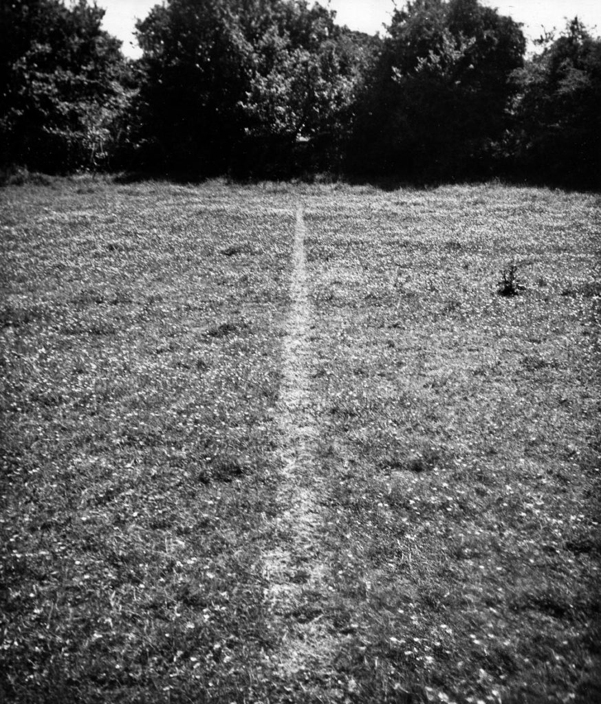
:: image via Richard Long
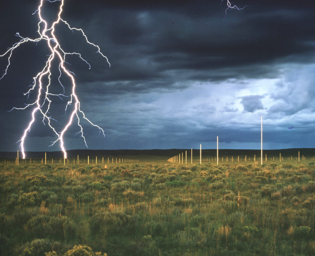
Another example is Walter De Maria’s The Lightning Field – seen below, which is the culmination of a long passage in the book that explores the idea of geometric patterning, constructed compositions such as grids, bands, figural fields – popularized by Peter Walker and inspired by the work of minimalist artists such as Frank Stella and Donald Judd. The simplicity of Walkers work can be considered austere in a way, “landscapes appear primarily in lines, extruded vertically as places that define spaces or trace streaks across the terrain. In their repetition they create visual rhythms, playing the individual element against the repetition of the field as an entirety.” (80)
This is one of the few times in the book where actual works of landscape architecture are discussed, owing to the fact that much work in the field is not ‘austere’ but more garden-like, perhaps?
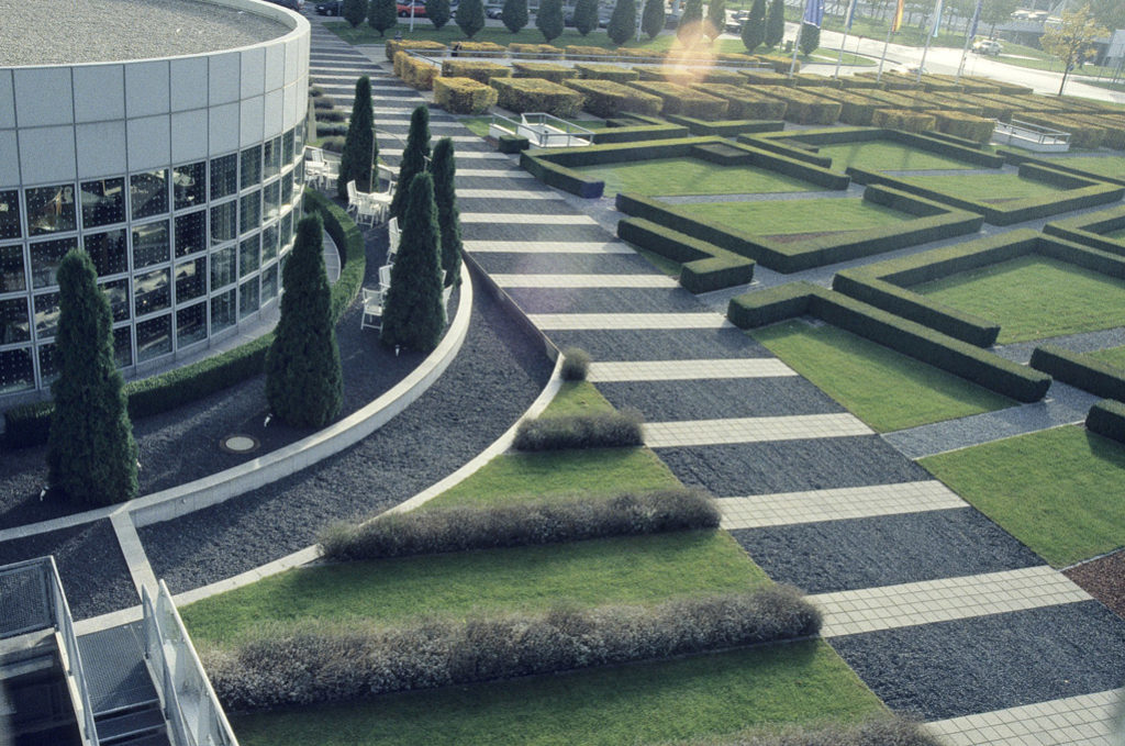
:: image via PWPLA
The result is described by Treib through the example of Edmund Burke’s “artificial sublime”, where he “suggested that a man-made creation of sufficient length and repetition might induce a similar effect…” to that of the true sublime. In De Maria’s work, this repetition is present but less distinct (perhaps due to the size and space in the landscape), where the steel poles “…fade into the landscape as the light changes or with any shifting in viewing position. The promenade through the field and the awareness of subtle changes in the surface, skies and the distance mesas equal in significance the precision of the stainless steel forest arranged mathematically.” (80)
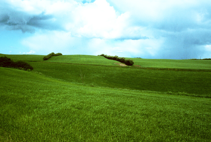
The idea of the connection of simple moves on the landscape that have been installed for functional reasons, such as hedgerows (and example from Jutland, Denmark below) which “make evident what to many had been only latent, with the rows of trees demarking the contours of the land.” (29) This hints at a powerful opportunity to mark space, as well as controlling wind and sunlight, that could be employed at large and small scales using very simple means.
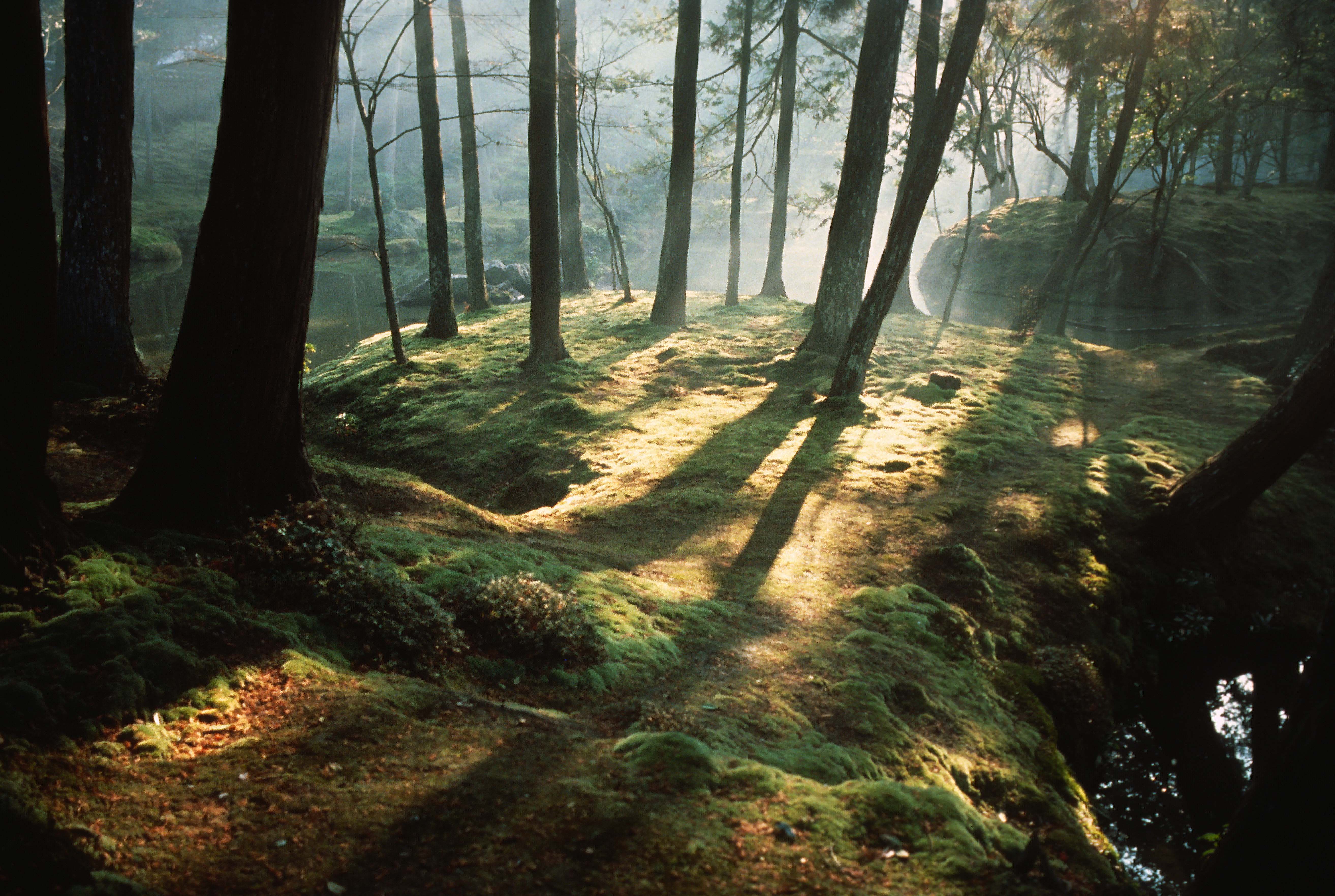
The influence of Japanese gardens, particularly the spare minimalism of the form and it’s simple palette, seen in Saiho-ji garden in Kyoto, the banner image above and repeated below. For Treib, “Austerity does not always connote deprivation, however, but is user here to suggest a restriction in means. Richness within austerity is a hallmark of Japanese visual culture, and pairing the words ‘austere’ and ‘beauty’ is no anomaly within its aesthetic thinking…” He continues, “Austerity her lies in the acceptance – or adoption, if consciously made – of few prevailing materials, or even only one: in this case moss. It also requires restraint. By restricting the palette to water, trees, and moss, one becomes more aware of each constituent element.” (17)

A different Japanese form is the torii, or a gate without a fence, where it serves as a place-marker. “Although one may physically pass through it, the gateway functions more as a sign and a mental stimulus… Figures like the torii gain presence from their contrast with the surroundings.” (46)

Plenty more examples abound in the text, many that were new to me. The simple tools of observation such as Trace, and the intervention using Intent, provides some interesting ways of looking at design in a new way. Simple rules of Addition and Subtraction (Figure and Void) can be employed artistically in environmental art, but also give us opportunities to incorporate into more function-driven works on landscape architecture. The clues in the landscape (the ordinary and the functional) that are not explicity trying to capture the Eden-like garden of transcendence, but rather look to ways of making relevant austere spaces.
It’s interesting to note that, although often simple, it’s not just about removal (of materials, ornament, etc.) as Treib mentions was a possible flaw of modernist architecture where “simplicity was commonly achieved by elimination… what is experience close in is rarely greater that what can be seen at a distance.” Instead positing that: “Compression, in contrast to reduction, brings into seemingly simple surfaces and spaces constellations of details revealed only through movement and over time.” (63)
This can happen with erosion, patina, as well as playing on seasonality and light, even with few elements, as long as they are employed with the goals of experiential quality in mind.
It’s heartening to see a simple (austere) work that is so full of inspirations. I’ve always been drawn to work of environmental artists, and this has reinforced the idea that there is much for designers to learn from to enliven their work. The ordinary and functional landscapes also provide inspiration not just in development of contextual design, but in how they provide form and manipulate space and microclimate.
There’s also the biophilic and the concepts of inspirations of nature through biomimicry, which Treib mentions comes with an “economy of means”, with beehives, spider webs, birds nests and termite mounds representing “the transformation of minimal materials into an efficient and functional configuration. Maximizing the minimal.” (91)
The book is a no-brainer, easy to access and inspiring on multiple levels. It will not make you work but will make you think. About design. About inspiration. About purpose and what he calls Attending, or “in what way do we view, process, and evaluate what is before us?” (94) As we focus on environmental sustainability as a means and an ends, Treib’s final words perhaps gives the reason to engage in the book: “Following the directives of environmental responsibility provides only the basis for our designs; an appreciation of the austere landscape can direct its making and enrich our experience of the garden that results.” (100)
All images via Oro Editions unless otherwise noted.
