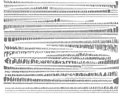
Amazing new maps from an L+U favorite, Strange Maps, featuring ‘A Taxonomy of City Maps: “Imagined cities built from the fragments of real ones: something similar is happening in Tout bien rangé, a cartography-based artwork by French artist Armelle Caron. It consists of a series of map pairs, one a blind, but recognisably real city map, the other what looks like an assembly kit for that same city, with the its blocks impracticably but neatly arranged by shape and size.”
A few selected cities such as New York (top) and Berlin (bottom) – click to enlarge images:
And a closeup of the two panels from Paris – to see some more detail:
As mentioned, “Caron strips cities of their spatial context. Roads and rivers become irrelevant, districts and parks disappear. The relationship between built-up areas and empty spaces is obliterated.” See more on Armelle Caron’s website


Hello, nice to see Armelle’s work published everywhere now! I wrote, months ago, an analysis on this work with a linguistical aproach.
But it’s in French;-) Meanwhile, Soks-Studio has give an english abstract of my purpose.
Bests
Matthieu
these figure/ground drawings are beautiful and powerful, but also extremely problematic, in that they explicitly reduce a place or territory to a binary condition (re your last post…).
i think edgar rubin and gestalt theories are the foundation there, and troubling when transferred to the city scale (part of the tendency toward reduction and simplification that was amplified in modern times)
Agreed. I have a number of issues with figure/ground binary as reductive as well. These are just kind of interesting (more art, as you mention) and I think one way of looking at some gross, macro-level analysis and comparison of the structure of different cities (with certain cautions) in terms of the blocks in which they emerge. It’s probably just intriguing to me as a way of getting the brain out of thinking of the whole and looking at the parts in a different way.
The comparative study of different urban grids and their origins (like this) are interesting in isolating different historical development periods, but grand proclamations of the superiority of one form of city and criticism of the grid as organizational scheme become problematic (like this)
Figure ground scale comparisons, for instance those Allan Jacobs’ “Great Streets” (which blew me away as an undergrad) offer one interesting view, perhaps just for comparison only. But as I mentioned in the grid post earlier, and you mention, reducing study to a grid or a figure/ground does have a tendency to oversimplify the complexity of cities to the Nolli-esque binary mode.
I would flunk any of my students for submitting one of these drawings as site analysis. That said, they are pretty graphics!
Yeah Barry – I think these are pretty ‘typologies’ not site analysis diagrams so I’d say an F is in order if that was the plan 🙂
…in that ‘typology study’ we miss out what is important – the typology of the city space… and then what is the negative space in the ‘new cities” maps seems very problematic, not saying useless for the city dweller.
i find work or Armelle very appealing from artistic point of view and provocative for us planners and architects…