In the blogosphere, this is old news now. It’s been a week since I heard about the death of landscape architectural icon Lawrence Halprin – actually the day after while in a meeting where part of the topic was discussing the iconic nature of his park sequence in Portland as inspiration for a small plaza I am designing. We looked at the inspiration – not the copying of the forms – and I of course found my way back to his sketches of the sequence.

:: image via Halprin Landscape Conservancy
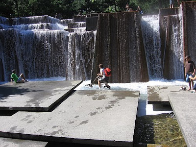
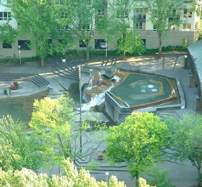
I was reminded of one of the items that originally to Portland – as we had learned about the work, particularly those in the sequence below. Eager to see some real ‘landscape architecture’ I hurriedly visited downtown to see these in person soon after moving to town. How disappointing in person, to see the gray, life-less, broken space of the Auditorium Forecourt Fountain (now Keller Fountain) as it was shut down pending repairs to pumping equipment. I was deflated, and walked the sequence seeing this project in it’s full rainy, gray splendor with not a person in sight. It was a formative experience in disconnection with the aura of a space and the designer vs. the space in action.

:: image via Halprin Landscape Conservancy
To my wonderful surprise, I visited a year later, at the height of summer, pumps functioning, and the space was literally crawling with people. Then I realized that I was only seeing one facet of the story – not the entire design, or the changes in use over time, and seasons, and day and night. I had a similar experience the first time I visited the Keller Auditorium for a play and sat at intermission looking over the fountain lit in an eerie glow – providing the forecourt not just from outside but within the building itself, connecting architecture and landscape.

:: Keller (Forecourt) Fountain – image via artscatter
The first day of ‘Intro to Landscape Architecture’ class I was teaching at Portland State, we took a tour of the sequence as a primer on what the profession is all about – and I was amazed that many of the students hadn’t known about the spaces (mere blocks from campus) and what the opinions of the space were – both good and bad. Even without knowing, the spaces can still teach.

:: Pettygrove Park – image via Oregon Sustainability Center

:: Lovejoy Fountain – image via World is Round
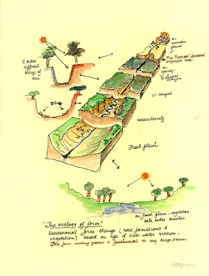
The other aspect I loved in school and still today is the lively sketches. These are not art per se, but serious and whimsical studies and exercises in seeing and understanding. These taught me that it’s important to look and draw, and that the benefit to yourself is the point, not some form of artistic integrity. They also showed a realization of contextual forms and processes and generators of design inspiration. And they become beautiful because you see the inspiration expressed and abstracted within the designs.

:: image via Halprin Landscape Conservancy
A final snippet of story came on a visit to Seattle to see Freeway Park as well, which was amazing and beautiful in places, and a similar expression of abstracted concrete mountains. It was also a true expression of a dated, somewhat irrelevant and possibly dangerous space that harbored unsavory elements and activities – and perhaps was not part of the original context. This made me wonder about the longevity and relevance of spaces and the need to protect and restore icons – but also our need to let some of them go (or at least change to meet the times). It’s a tricky thing for landscape architects to design timeless – when our materials are always changing.

:: image via hugeasscity
Strange how the formative aspects of life in landscape architecture get played out in time and history. I actually also had an opportunity to redo one of the Halprin-(esque perhaps) projects done with SOM on some towers in the auditorium district (the now remodeled Harrison West complex) – and the limits of concrete, ivy, and trees in making space for people – and how the 60s and 70s, much like in architecture created some great, and some laughable projects.
This affected me like the passing of Ian McHarg a few years back, which struck hard. came when I was amidst a complex, layered, mapping exercise which directly reflected the legacy of integrated planning, and for me personally that the access to many disparate layers of data – together – is a powerful notion. McHarg and Halprin were much more accessible heroes than Olmsted – because they were living in the same world that I was as a youthful LA.
More good reading on the subject is found at the Oregonian, Art Scatter, Portland Architecture, and Inspiration Wall. I’ve been remiss on reading the blogs lately – but imagine there is an outpouring of wonderful stories – which are deserved. I learned much from Halprin’s work and went through amazement, disappointment, reality, and acknowledgment that landscape and taste changes, and that all good design draws from place, engages people in many ways, and is timeless… much like city itself. I wasn’t quite as obsessed with the man and his work as some others locally – nor did I visit the spaces often, but nonetheless personally he will be misse. Thankfull, he will not be forgotten in the many works and a legacy of design inspirations (and those inspired, such as myself) that he left behind.

I love that you can interact with that fountain. And all that crazy layering of pieces makes appear absolutely monumental. He seems like he was a great designer. Thanks.