I just passed a milestone of sorts… topping out at 500 posts (not to mention a few on the new Veg.itecture blog…). Seems like just yesterday I was starting this humble outlet for collecting thoughts – fighting with time to blog amidst time to work and occupying all of grey area in between. Often times, unknown to most readers, is the mirroring effect of my work and the topics of the posts on this blog so in this case, we’ll call it a rest stop on a long road-trip. This is true the past weeks or so, as I’ve been working on an interview for a green main street project, and thus had streets, and what makes them great and green – on the brain.

:: image via Good Magazine
So a collection of some of the transportation related inspirations I’ve collected recently, with a slim thread of connectivity (hehe) between them. First off, the visionary who seems to be able to understand the place and potential of streets in our urban fabric, Jan Gehl – with a great quote spotted via People and Place. “He credits his vision of the livable city to his wife – he claims that when he married, years ago, his psychiatrist wife demanded, “Why are architects not interested in people?” I have a simpler response… because landscape architects are 🙂

:: image via People and Place
“So Gehl became interested in people. “Being sweet to people is really sweet to the economy,” he says. (Hear that, Toronto City Council?) But how to be “sweet” to a city’s inhabitants? According to Gehl, a sweet city is lively, attractive, safe, sustainable, and healthy. And we already know how to do this: limit cars, encourage bicycling, and create better outdoor public spaces so that people can walk on the streets of our city.”
Gehl has made palatable the idea of the Dutch Woonerf – which has definitely been adopted by streets advocates as a viable alternative – with a few good US examples… tough to fit the Escalade down these, or more likely convice the local DOT that this is actually safer that the typical section.

:: image via Land+Living

:: image via Urban Greenery
Speaking of sections – one of the best resources on streets, even back when I was in college, is the visually simple yet telling volumes ‘Great Streets’ by Allan Jacobs. While I will always love the volume – there is a new digital resource from the Charrette Center featuring examples of Street Sections. In this case, and example from the “Via S. Romano Ferrara, Emiglia Romagna Italy – Pedestrian street in central historical district”. Cool, and thanks to People and Place for the heads up on this one.

:: images via Street Sections
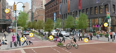
Jetson Green offers the visual and checklist of great streets (or should I say Livable ones) via Good Magazine. While this ring of cliche in the spirit of PPS public space elements, I guess here’s all you need:
- Allow street vendors
- Provide pedestrian street lamps
- Install curb extensions at crosswalks
-
Create dedicated bus lanes
-
Create dedicated bike lanes
- Install raised, textured crosswalks
- Adjust street lights to give lead to pedestrians
- Install bollards at intersections
-
Nurture street trees and plantings
- Use speeds bumps where necessary

:: image via Jetson Green
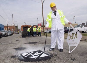
Zooming in a layer of detail, we often forget the illustrative potential of the plain black to gray street surfacing – a fine tabula rasa that is both functional and open to interpretation. A range from the serious to the dubious was found – including an elegant Crosswalk Memorial (via Urbanism) and a ridiculous albeit functional paving-repair-as-guerilla-advertising-by-dead-chicken-dude (via The Infrastructurist)

:: image via Urbanism.org

:: image via The Infrastructurist
And I guess if we can’t make green and make great the streets – the alternative is to green your form of transportation, like David Gallaugher did with this grass-lined wheel… looks more appealing than a Prius to me.

:: image via Urban Greenery
