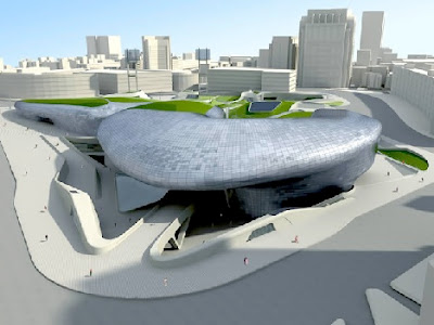
I’m somewhat ambivalent about the architecture of Zaha Hadid – as it is predominately removed from context and placed, like sculpture, in the landscape. The new 850,000 sf design museum, library and educational facility in Seoul, South Korea offers a glimpse of green surfacing over the typical organic blobs, in an attempt at innovation connection to social context.

:: image via Treehugger
Hadid is quoted in Treehugger (via Archinnovations): “A fundamental aim of the scheme is to bring delight and inspiration to the people of Seoul by establishing a cultural hub in the centre of one of the busiest and most historic districts of the city” says Zaha Hadid. “The design has been governed by the belief that architecture must enable people to think beyond existing boundaries to reach innovative design solutions. This combined investment in education and research, together with the city’s public cultural programmes will inspire new generations of designers, helping to maintain Korean industry’s reputation as a leader in innovation.”

:: image via Treehugger
The issue with schemes like this, which has been discussed many times, is the ‘landscape’ consists of complete inert and ambiguous green shades – denoting nothing specific about the material or its nature. Again the idea of painting on green (in this case with three lusty shades) misses the point of the idea of Veg.itecture to transcend mere decoration. The fact that the spaces are usable and accessible makes for a move in the right directions – but is this a range of grassy or sedum fields, or something akin to a real landscape? It’ll be interesting to see this move forward and more to interpret more detail on the future iterations and eventual final project.
I hate how sculpture/object buildings like these are a slap in the face to anyone who has to walk past it. The building itself may be interesting but what kind of face does it present at the edges? Is it friendly/interesting or is it a big blank wall and empty concrete at the edges?
The Seattle library fails spectacularly in this sense – it could have had interesting edges and presented an animated face to passers-by, except Koolhaas isn’t interested in anything outside his buildings, or in how his buildings interact with the world. It is an object, unrelated to anything around it.
Drives me bonkers.