From a representational point-of-view, it is interesting to see some of the ways in which representation plays a vital role in communication. I’ll inevitably revisit this some more, as it’s a topic worth exploring, but these examples span the photographic to the planimetric, while encapsulating a wide range of messages. To begin, it’s always interesting to see the popularity of documenting the urban conditions ala Alex Maclean – through semi-oblique aerial photography. His work stands on it’s own, as well as illustrating some great books like ‘Drosscape’ and ‘Reclaiming the American West’ and the idea of this form shows up often as a method for exploration of the territory between eye level and satellite aerial…
This method is become more popular – with a plane rental and some good camera work being the necessary ingredients… often more informational than artistic – this method offers an additional view of the world that provides something lacking in the true plan-representational aerial that is useful in planning. This is found in many sources, including amongst others, the views of the LA River in The Infrastructural City, as well as another great urban typology – that of ‘A Vocabulary of Sprawl’ from The Infrastructurist.

:: Ground Cover – image via The Infrastructurist

:: Ground Cover – image via The Infrastructurist
:: The Alligator – image via The Infrastructurist
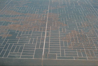
The traditional aerial photograph is still a great tool for many uses – either as a base map or a deeper analysis of land use. The accessibility of google earth and other high-resolution, easy to navigate sources is still used daily in our practice – and a hell of a lot easier than going to get blueprints of the mylars down at the city offices… A great example from Emergent Urbanism shows the figure-ground and ‘wasted’ space in our American gridded cartesian landscape: “Notice how much negative space is created by the imposition of the grid on a chaotic reality. The simplicity of the cartesian plan is deceptive. It generates complications as the random process of change unfolds.”
The traditional aerial photograph is still a great tool for many uses – either as a base map or a deeper analysis of land use. The accessibility of google earth and other high-resolution, easy to navigate sources is still used daily in our practice – and a hell of a lot easier than going to get blueprints of the mylars down at the city offices… A great example from Emergent Urbanism shows the figure-ground and ‘wasted’ space in our American gridded cartesian landscape: “Notice how much negative space is created by the imposition of the grid on a chaotic reality. The simplicity of the cartesian plan is deceptive. It generates complications as the random process of change unfolds.”
The ability to utilize a temporal series of traditional aerial photographs, such as this view of Las Vegas over the past 25 years (via Archidose)… offers another added value of the urban form and growth (or sprawl in this case)… “”These images of the western portion of the Las Vegas metropolitan area show the city’s steady spread into the adjacent desert landscape. Undeveloped land appears along the left edges of the top two images. Here, the land on the city’s outskirts appears in shades of beige and tan, with just a hint of the street grid to come. By 1989, however, development filled the upper left corner—a residential area, complete with curving roads and semicircle streets. In subsequent images, development spreads southward, and by 2004, the entire image shows cityscape, including Interstate 215 passing through southwestern portion of the city.”
The plan offers a somewhat quantifiable planning tool, as seen in the installation 49 Cities by Work AC – which delves into the ‘future’ of some of the most vivid and unrealized utopian proposals from over the years, such as Corbu’s Villa Radieuse and Koolhaas’ Exodus Plan for London (seen below): Via Arch Daily: “49 Cities sets out to crunch the numbers of several centuries of unrealized urbanism, all the way from the Roman city to the great utopian projects of the 20th century. Through plans, sections, diagrams, charts and scale drawings, 49 cities are observed statistically and presented in an unprecedented comparative study, the result of a research project conducted over several years. Despite the fact that they never actually existed, this history of utopian urbanism provides a remarkable insight into our understanding of the contemporary metropolis.”
:: image via Arch Daily
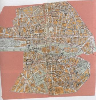
The illustrative quality is definitely captured in the sketchy planning maps – reminiscent of the on-the-fly analysis of Kevin Lynch and his Image of the City – outlining landmarks, nodes, paths, edges, and so on. These maps by Guy Debord, seen via Vulgare, show a number of interesting ideas of analysis for Paris…
A similar investigation spotted on the Portland Architecture blog reminded me of how evocative a selective display of information can be. In this case, a diagram showing a selected dataset, including major roadways, nodes, and parks – with the interstitial spaces being left blank as sort of an ambiguous filler… it’s very much a representation of the fabric of Portland, neatly captured in a simple diagram.
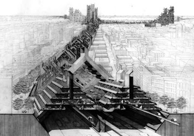
To the other extreme, there is the visually dense drawings of one of my favorites, Lebbeus Woods or in this case, a reference to Paul Rudolph’s illustrative technique, via urbanism.org: “Despite a number of monographs, including the mammoth Paul Rudolph: Architectural Drawings with its terrifyingly detailed, Piranesi-esque images, Paul Rudolph’s architecture is not easy to fully comprehend. Paradoxically, it could be argued that precisely because of the unsparingly detailed drawings of complex plans and sections, the tendency is to be overwhelmed rather than enlightened. Rudolph’s architecture is as densely “architectural” as it comes.”
:: image via urbanism.org
The interesting thing is there isn’t any ‘right’ way of communicating data and ideas, but there are many rules that offer some much needed guidance for legibility, orientation, and scale. Always a cartophile, a recent link via cityofsound to a fabulous blog called Making Maps: DIY Cartography, offered some wisdom of one of my favorites, Edward Tufte, towards the making of maps in this 2007 post entitled ‘How Useful is Tufte for Making Maps?’. Read it all, then read/absorb Tufte, it’s wonderful.


I love this blog! Sorry I don’t comment enough. The last few images are really informative and inspirational.