As I recently mentioned, there is a steady parade of visuals promoting the veg.itectural – which make sense. The distance from idea to implementation is a common theme, and requires an amazingly large amount of coordination, client will, and ingenuity. We are constantly underwhelmed by the result – but more often amazed by what is actually available when the all of the stars align. A pair of posts, starting here, looks at the updated walls and roofs in the Vegitecture series.
WALLS
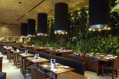
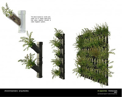
Walls… living, green, vegetated? Where to start. Jetson Green goes retro in an advert/post for Green Screen the old standby trellis system used on many a project. Urban Greenery drops a few old projects from Patrick Blanc in both Thailand and France. And for some newer content, first, via Inhabitat, is from Mexico City’s El Japonez Restaurant, by Serrano Cherrem Architects‘ project with an inventive solid wall of vegetation. The wall, aside from being stunning, has purpose: “More than decorative in nature, the wall helps keep the thermostat steady throughout the year while infusing the interior spaces with fresh air.” See some images and details below.
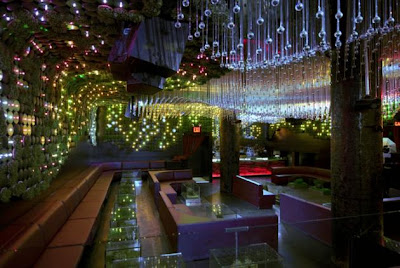
So you decide. Is the ‘living system’ or the artificial ‘dynamic richness of nature’ more successful? I guess they are both relevant, but real vs. metaphorical nature is one of those easy ones to get polarized about… Another hybrid is the Mossenger, spotted via VULGARE in the post Mossenger. The project entitled ‘Sporeborn’ by Anna Garforth uses moss as ink for wall-mounted writing.


