An email from Mannisi Alban alerted me to some of the fine graphic work that is present on the Seiwooo site – a portfolio of work spanning the past ten years. It’s rare to find a wide range of different graphic techniques in one spot, so these are definitely worthy of a look – if merely to get some thoughts on that project you’re working on. A visit to the opening screen shows a landscape scene, along with a chronological menu of projects to pick and choose – or if you’re linear – move forward or reverse in history.

:: image via Seiwooo
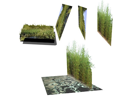
Not at all inclusive, I’ve chosen to feature a few projects that spoke to me in certain ways – purely from a visual standpoint – not necessarily in design or content. Starting off, the Beach Road Competition from Singapore (2007) was a collaboration with EDAW Singapore & SAA Architect – and features a range of style – spanning from sketchup 3-D like overall form and a variety of photoshop collage perspective sketches offer colorful examples of landscape spaces.

:: images via Seiwooo
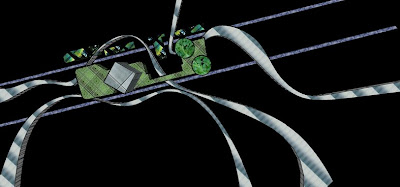
A different mood is evoked in the more dark and moody ‘Cause and becomming of the particular situations of Transit Zones’ from Ile de France, France – 2004 – which features some designs for Charles de Gaulle Airport as an international gateway.
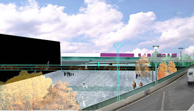
:: images via Seiwooo
The signature of Mass Studies is seen in the colloaborative effort with Seiwooo for the S Trenue Tower in Seoul, Korea from 2006 – showing some of the evolution of the form – along with the final product.
:: images via Seiwooo
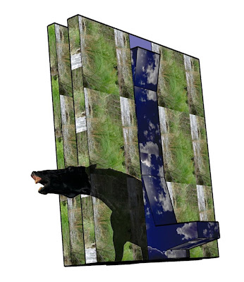
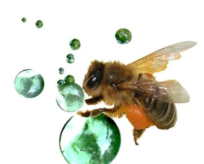
Another veg.itectural example from Seiwooo again combines the landscape with architecture from Mass Studies – the Jukjeon Hildersheim Housing in South Korea – offers some scale jumping from the molecular to the site planning size…
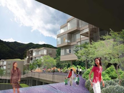
:: images via Seiwooo
Definitely check out the site for some visual inspiration. You definitely won’t be disappointed, and the inventiveness is worthy of praise. Not all of these images fit the model of glossy artificial photoshopped worlds – but rather range from what amounts to digital ‘concept’ sketches – showing an iterative process that layers simple forms onto materials, and ends up with a compelling visual. It’s also interesting to see the evolution of the portfolio over time – and the used of a variety of media – showing how technology and expanded accessible graphic options have changed the way we visually communicate. I will post some further exploration of the Seiwooo site and the explorations of veg.itecture – which is one of the topics of the upcoming VIVA series. Something to learn from indeed.
