As promised, a slight modification of the Veg.itecture posts – due both to the enormous amounts of projects out there, but also based on a need for some different needs for both built and design projects. So, as promised – in the upcoming 50th post on the series on Vegetated Architecture, an evolution of sorts that provides some of the flexibility to address a broader spectrum of these literally ‘green’ projects.
VIVA = Veg.itecture In Visual Assessment
This is designation is provided to capture the widespread conceptual adoption of the use of greening facades, rooftops, and interiors – but do not provide a whole lot of information – sort of the who, what, and where – but not necessarily the why nor the how. Part representational critique, part speculative narrative, these posts will explore the potential of the movement.

:: ORDOS 100 residence, by Architects: R&Sie(n) – images via Arch Daily
VIA = Veg.itecture in Action
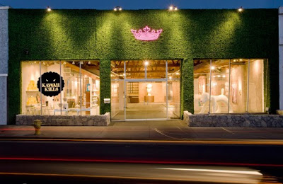
This designation is aimed at a more rigorous analysis of both vegetated architecture projects and principles – using built projects (or those unbuilt projects with significant information and details available). More detailed and critical, the aim of these posts will be to learn and expand the potential of what is possible in the craft. The reality of these projects can be deconstructed – although there still is some potential information gaps – like determining whether the below project is real turf or synthetic… i honestly can’t tell, but I’m guessing the latter.

:: Royal T Project by wHY Architecture – images via Arch Daily
As always, there will be additional posts looking at more specific ideas, technologies, and projects in greater detail – but look forward to the continuing series of posts periodically in both VIVA and VIA categories – marking a continual refinement of Landscape+Urbanism and the coverage of this sub-genre of architecture, landscape and urbanis, a phenomenon that is sure to continue in 2009.


As an architecture student, I get a little TO’ed over how much glory the projects that use photoshop’s “green” filter get. Its great to have an idea of a wall being made out of plants but until you get into the detail of what it is and how it works it is really hard to comment usefully on. I’m glad to see other professionals recognizing that.
I agree that designers need to acknowledge and be aware of technological limitations in the realization of these grand ideas. but at the same time, though, it doesn’t hurt to go over the top and envisage an entirely new vision, does it? after all, it’s the advent of photoshop itself that has helped us generating ideas, feasibility aside, that otherwise would have been inconceivable, say, 50 years ago.
I think there’s definitely a need for both sides of the coin. On one hand some more rigor and reality to solutions gives us all a bit more credibility in creating these ‘visons’. On the other, if we constantly do the status quo and don’t envison new strategies – we stagnate in the same thing – or worse yet, backslide into only those things within our comfort level.
I think the mix and the interplay between vision and praxis is the key. So photoshop away – and figure out how the hell to build the thing as well.