It’s been a bit of time since I’ve referenced some of both the definitions of Veg.itecture and some of the issues of implementation… perhaps a review is in order – or at least a refresher tied to some of the discussions regarding the projects that appear here on L+U. There’s the definition and the specific typologies – as well as some of the variants that have evolved from rooftop to the encompassing envelopes and fantastic facades.

:: image via Dwell
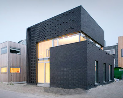
Some cool examples of this… starting with some more structural examples. The first, via Inhabitat, is the IJburg House by Marc Koehler – with some facade based pockets, or barges for vegetation: “Rather than be limited by the small lot size, Koehler was inspired to create a vertical garden, merging nature and culture in on simple structure. The brick detailing draws inspiration from the famous Amsterdamse school style of the 1920s and serves both as gorgeous ornament and as an integral underlay for the different sorts of climbing plants that will eventually grow up the facade. Plant barges are built in on several levels.”
:: images via Inhabitat
The limited of the size of planters will inevitably limit the growth of whatever vegetation is grown in these barges – which will provide a very ‘natural’ looking facade as the plants grow. Also, depending on climate and microclimate, there is a drying that will occur, making it somewhat of a challenge to keep the plants viable and pleasing. This will be interesting to see how it develops into the future.

:: images via Inhabitat
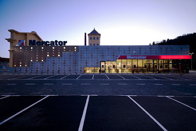
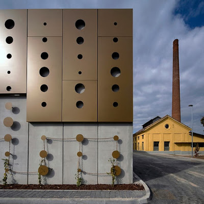
Another interesting example of an articulated facade is the shopping mall in Slovenia by Ofis Arhitekti have (via Dezeen). Building off the simple figure-ground relationship of circles and voids, this ‘Dot Envelope’ offers an underlying grid, via chains, to allow for the growth of vegetation along partial portions of the facade.
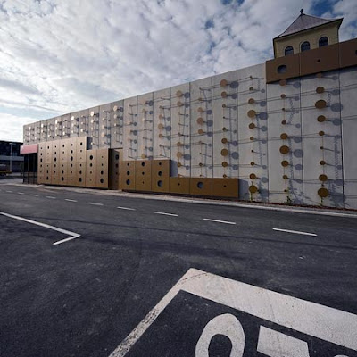
:: images via Dezeen
This may be another one of those cases where time will tell whether the project will work. As it’s hard to discern the specific detailing, plant species, and configuration – it’s hard to estimate the potential success. This design relies on the more traditional idea of vining plants grown from terrestrial plant beds. The future juxtaposition of these vining ‘lines’ will create some contrast to the very geometric panel system – although I’m dubious of the rigidity of the chains as they are weighted with future plant mass.
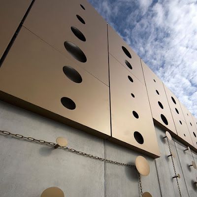
:: images via Dezeen
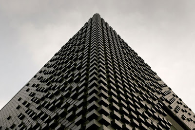
A more abstract example (via Treehugger) that has been shown before on L+U is the 110 Embarcadero, in San Francisco, from Pelli Clarke Pelli. This perhaps is one of those projects that best sums up the graphic v. reality argument, as it gives little clue to how one would build and maintain the plants. The impact graphically is stunning… in reality, we shall see? Anyone know of some more detail on this project they can share?
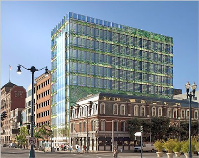
:: image via Treehugger
And a very recent similar (yet expansive) ‘vision’ from MVRDV for the Gwanggyo City Centre near Seoul, South Korea has shown up everywhere in the past two days. This one is from Contemporist, and it’s a bit surreal for sure… the stratified bands of vegetation (box hedges? really?) around these, indicative of the surrounding landscape: “The site is surrounded by a beautiful lake and forested hills, the design aims to create a landscape on top of the new program that enlarges the green qualities and that links the surrounding parks by turning the site into a park. The shifting of the floors causes as a counter effect hollow cores that form large atriums…”

:: images via Contemporist
Via Contemporist: “To facilitate this all elements are designed as rings. By pushing these rings outwards, every part of the program receives a terrace for outdoor life. Plantations around the terraces with a floor to floor circulation system store water and irrigate the plants. The roofs of these hills and the terraces are planted with box hedges creating a strong, recognizable, cohesive park. This vertical park will improve the climate and ventilation, reduce energy and water usage. As a result a series of overgrown green ‘hills’ appear in the landscape.”

:: images via Contemporist
So as we regroup and look for how to make these visions a reality, we start to see more and more successes throughout the design world that give examples to start to resolve the visionary into the real. While not as dramatic as their renderings (few designs are) – they are real, tangible and planted… one interior Blanc-esque example from Contemporist, shows interior plants from landscape architect Michael Hellgren for pharmaceutical company AstraZeneca in Södertälje, Sweden.
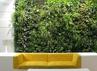
:: images via Contemporist
And coming full circle from box to green box… a fantastically simple version via Arch Daily. The CR Land Guanganmen Green Technology Showroom by Vector Architects is located in Beijing, China – and is a simple plan for this temporary structure: “The idea is to develop the concept of “Temporary” from a meaningful perspective, to design a piece of floating “installation” in the garden, which could be built, demolished, and recycled through an easy and straightforward way with the least impact to the planned site.”

:: images via Arch Daily
Project goals for the Vertical Grass Wall Paneling system and Green Roof via Arch Daily, could be another definition of Veg.itecture:
“1. Reduce the heat gain and loss and enhance the thermal efficiency.
2. The grass panels will reduce storm water runoff.
3. Although the central lawn is taken away to make room for this building, but we effectively tripled the original planting area by using the grass panels on the roof and two facades.
4. Grass wall panel is planned to be relocated onto the partial fence of the residential compound after demolition. 5. Visually harmonize the temporary structure with the existing garden and the so called “Classic Spanish” Style “

:: images via Arch Daily
And a different sort of shroud is our clutching to the amorphous directives of ‘sustainability’ – perhaps our most mysterious ‘green shroud. Definitely check out this quick article by David Cook, a partner in Behnisch Architekten, as he explains the ‘real’ meaning of green architecture via Flavorwire. A hint… it’s actually green:
“Increasingly misused in architecture, the term sustainability is in danger of becoming a mere label. In man’s relatively short occupation of the Earth, we have succeeded in acutely threatening its future and our habitat. However, we now appear to be gaining a common understanding of the urgency of these matters. Perhaps, for whatever reason, we have finally reached a “tipping point,” where we cannot remain in denial. For us sustainability is less a political issue than a humanistic issue; for qualities are just as important as quantities and a “sustainable,” or indeed “green,” architecture must not solely focus on environmental constraints or pre-defined performance criteria, but also celebrate the wealth and diversity of nature.”
