The Urban Dictionary is a fabulous resource for staying current on the constantly evolving lingo (alongside a weekly dose of William Safire). One new addition to my lexicon, via a tricked out SUV rolling by a few weeks back is the term Flossin‘ (that’s sans g, in the Palin tradition). The short of it, it’s showing off your goods, or via the UD: “Rolling in a fine ride with the general intent to enjoy ostenstation, prestige.”
In a major cultural mashup, I’m co-opting the term to include the use of beautiful site furnishings or other landscape architectural bling – a similar usage to the urban term. Time for Flossin’… starting with a man who knows ostenstation… Frank Gehry. Via Tropolism > Core 77, the: “the visitors bench for the World Company building in Tokyo” definitely fits the bill with it’s swoopy shapes.

:: images via Core 77
Contemporist shows up The Diagram Bench from Swedish furniture manufacturer Nola: “Architects Clara Lindencrona and Karin Andersson usually design in response to an existing landscape, but their plastic-fibre ‘Diagram’ bench seems to be a landscape in itself. ‘Diagram’s precipitous backrest brings the outline of mountain range to mind, while its rippling surface suggests a topography of mountain plateaux sloping towards the sea. The bench is a beautiful compliment to a contemporary gallery or a modern museum – where it could be mistaken for an artwork – yet tough enough to be the school playground’s coolest attraction.” Here in well posed shiny black:

:: image via Contemporist
And in situ in yellow…

:: images via Contemporist
Designboom has a bench that is perhaps not ostentatious – but a stand out nonetheless. The lin pod bench by leif-designpark: “…stands out because of its elongated seat which is designed to hold a potted plant. reclining on the bench immerses the sitter in the greenery, as if they were sitting in nature. the bench is built using a wood base and upholstered seat that is embroidered with an abstract line pattern.”

:: images via Designboom
Also, the scale can increase to site structures, such as this shelter, via IM – from the london design festival 08 preview: tom dixon at 100% detail:

:: image via IM
And this elegant playground via eye candy – from nocturnal design lab:

:: images via eye candy
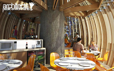
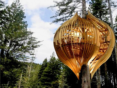
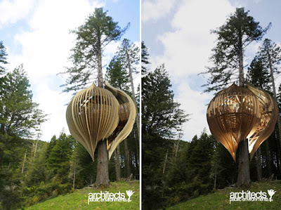
And coming full circle via Inhabitat – perhaps the best true example of flossin’ a tree with a somewhat intrusive (to the tree at least) Yellow Treehouse Restaurant in New Zealand by Pacific Environments Architects Ltd. Taking tree-sitting to a new aesthetic level – this building is perched within a redwood tree. Ironically enough, this wood structure occupying a tree is perhaps a fitting testimony to it’s patron, the Yellow Pages – which is responsible for massive paper waste on a yearly basis… Inhabitat mentions 5% of landfill waste annually – perhaps houses made from old phone books would be preferable?

:: image via Inhabitat


