It’s been a long while since I’ve posted anything on materials… perhaps due to the work I’ve been engaged in, and the fact that little of it is dealing with material selection, or the recent focus on evaluating the more sustainable materiality – sans aesthetics. That is not to say that materials don’t constantly play a role in our design – and here’s a range of some great examples of landscape, architectural, and micro-materials that offer a little design inspiration to us all…
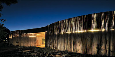
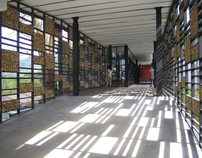
Let’s start with the more natural – a range of projects with woody representation, each with its own individual beauty. For starters, Camping Service, is an open-air facade by Archea Associati, uses bamboo for a variety of uses. Via Coolboom: “…the colors and materials that define the edges of the main volumes are borrowed from the natural surroundings, like the faded ochre of the bamboo canes that interact with the color and vertical extension of the ancient pine trees, decking the exterior and interior walls with a luminous, lightweight quality. The ceiling, also finished in bamboo, is pierced by skylights defined by the sun that subtly lights the interiors, highlighting small green oases.”

:: images via Coolboom
The Boh Visitor Center (via Arch Daily) offers a different wood grain, with end-oriented rounds arrayed in architectural panels, which, frankly, are pretty amazing.

:: images via Arch Daily
A very interesting exterior showcases the EDF national archives by LAN Architecture: Via Designboom: “…nature’s reflection on the patterned mirror exterior of the EDF archives center is a signal of the building environmental considerations. a double concrete façade provides insulation for the 5 story building. the building’s isolated location made it necessary to also implement a wastewater treatment system to maintain a supply of fresh water. photovoltaic panels and hot air pump were added to make it self-sufficient with regards to energy. these steps help this building have minimal environmental impact, while the alluring façade only encourages a greater appreciation for the surrounding environment.” 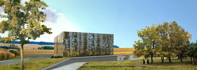
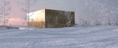
:: images via Designboom
Another zoomy facade patterning…
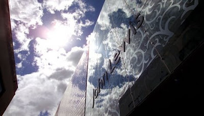
:: image via BDonline
Some more architectural texturing, via Archidose, this time for The NYU Department of Philosophy in New York City by Steven Holl Architects.
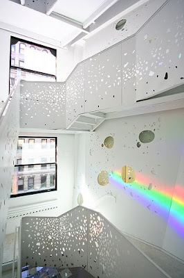
:: image via Archidose
A more regular patterning, the hexagon, is the basis for the Altamirano Walk in Chile via Arch Daily. “A simple prefabricated hexagon-shaped concrete slab became the constructive base for the project, with variations of texture and composition. The shades follow the same principle dictated by the hexagon, maximazing the commercial format of the material which, in this case, is steel.”
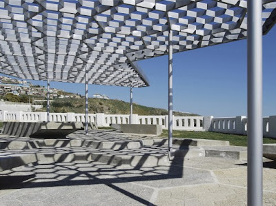
:: images via Arch Daily
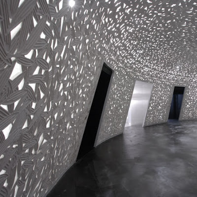
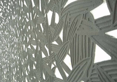
An organic material essence drapes the interior by Architect Nobuhiro Nakamura of A-Asterisk has for Leafy Shade an interior project that abstracts vegetative forms.

:: images via Dezeen
Switching to metal… MoCo Loco has an interesting detail for metal bracing for a simple piece of furniture by Donald Corey. Simple and sweet – with an organic form.

:: image via MoCo Loco
