An important and somewhat overlooked aspect of Veg.itectural design is the connection and use of the ground plane in providing critical aspects of the shelter. Whether traditional cave-like dwellings that are carved into the sides of hills, or northern european era sod hut housing. These items are used for literally centuries, and there are still notable archaic examples of this technology – as well as a range of new variations on this theme. Here are some recently examples.
On the far end of the continuum, via Treehugger, the secret green community Brithdir Mawr in Wales… long undetected on public land in a national park. How did they stay under the radar… perhaps with vegetated rooftops obscuring the location from above…
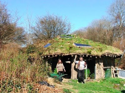
:: The Roundhouse – image via Treehugger
Dwell gets into the game with a post about Earth-Sheltered Homes (with a reference as well to Bill Gates grassy-roof mansion as well). Here’s a pic of the Cumbria Earth Sheltered House, which is pretty cool… and reminiscent of the EarthShips in Taos. The idea is summed up on Dwell pretty well: “…the house disappears into the landscape “making it unobtrusive visually as well as ecologically.”
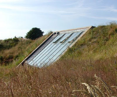
:: image via Dwell
A few variations on this theme… including Villa UH1 which used a combination of earth sheltering with grounded ecoroof by RB Arkitektur. From WAN, they: “…sought to make the building as much a natural part of the site as possible. … In order to emphasize the landscaped aspect of the house, they let the roof literally grow out of the ground and become covered by sedum plants, thus eliminating the border between building and landscape.”

:: image via WAN
Another simple example via Arch Daily is of the sloped rooftop access for the Barreiro College of Technology: “The architecture becomes more topographic in one of the extremities of the building, where there is no way to tell where the surrounding starts or ends, and in the opposite side, with its more present limits, defined by the alignment of the tops of the different bodies of the building.” Check closely on the photo for the ‘fencing’ that is preventing climbing up to the tops of these roofs…

:: image via Arch Daily
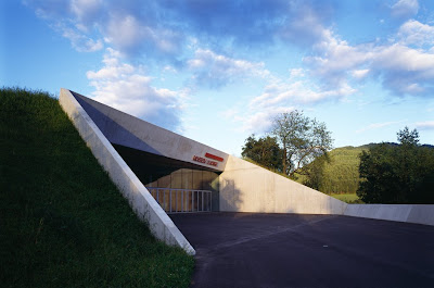
Another interesting example is the Liaunig Museum in Austria, with an earth-embedded form along with an interesting entrance… via WAN.
.jpg)
:: images via WAN
A refined example via Treehugger (where the sexy images have mysteriously disappeared) for a Hilton hotel that is being developed in Bariloche, Argentina. I managed to scrape up a few from another site… but you get the point.
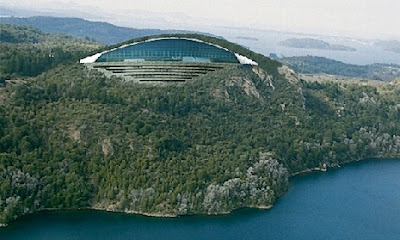
:: image via muy patagonia
Via Treehugger, this eco-friendly project relies on “…the hotel layout, which will blend with the mountain it’s located in to reduce visual impact, and the fact that during the building process and later in its operational phase, the hotel will have efficient use of energy and water and “proper management of soil and drainage.”
Somehow I think maybe not building anything in this pristine area would be the most ‘eco-friendly’. This is one of the major ethical dilemmas of green building – to build, to not build – and if you are going to build, to do so in the most ecological way.
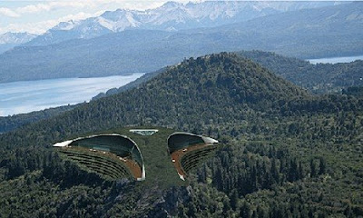
:: image via muy patagonia
Now things get a little crazy… to end it off, a couple of projects that I feel have a lot in common. The first, via Treehugger is a project by MVRDV for one of the ‘designer’ projects at the NextGene 20 development (read more about this from an earlier L+U post here). Observer House is interesting in the fact that is provides some flexibility of program and process, as MVRDV: “…designed a house which maintained gigantic window scene, within this window scene there consist various elements of spatial topics, each spatial topic, according to residential demand, is able to reformat, to reach the maximum desired living atmosphere.”
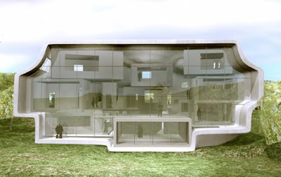
:: images via Treehugger
These spatial arrangements offer a range of forms, each one ‘draped’ with vegetation, which offer some interesting potential vertical and horizonal building greening…
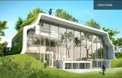
:: images via Treehugger
…and perhaps one of the ugliest architectural models I’ve ever seen – carved out of a welcome mat of synthetic greenery. Rank.
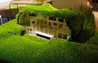
:: images via Treehugger
Or is it more of a precursor to a new genre of ‘green’ buildings that eschew the actual landscape materials (and most of the benefits) by cladding their buildings in fake greenery. The first example from the Amalia House (on L+U previously here) was a shot across the bow… and the latest edition of the Sports and Leisure Centre by ACXT Langreo, Spain gives another high-profile example.


:: image via Arch Daily
Via Arch Daily, some explanation and additional imagery. “The idea submitted was based on this concept: to propose a new landscape rather than a new building. To waste nothing of the existing available land. … A composition made up of folds, green waves, in which each of these correlated with the different interior spaces: the swimming-pool, a sports hall which could be converted for concerts, gymnasia, etc.”

:: images via Arch Daily
Some more… “The initial idea of designing the roofs for people to walk on them was abandoned due to the danger of accidental falls and the high maintenance costs. These were finally covered with artificial grass.
There are three roofs corresponding to the three well-differentiated areas into which the programme is divided: 1. Multi-purpose sports hall (sports + concerts), 2. Swimming pool area (walls formed by TECHNAL curtain walls), 3. Area for the remaining services (offices, multi-purpose rooms, sauna, etc).”

:: images via Arch Daily
It’s interesting, and I really like the idea (and the final look) – up until they get to the end and wrap this building in astroturf. For all of the lofty goals of integrating with nature the final result is a far cry from the good intentions. But in the end, don’t drape the building in synthetic material and throw some disingenuous bullshit with some text (via Arch Daily): “In Langreo, the general impression is that there is little land available. The existing space was taken up by the surrounding mountains, the hitherto booming industrial area and the homes of all those who had found work there. The idea submitted was based on this concept: to propose a new landscape rather than a new building. To waste nothing of the existing available land.”
At the end it’s part of a wide and historic continuum, and we are apt to see more of these throw-away designs that talk a lot of talk but not really doing anything ecological or valuable – just good and artistic. As we evolve from the simple tucked in earth-sheltered designs, to more robust and wonderous examples in a number of projects… connecting earth to sky – we are confronted with a wide span of potential solutions – as well as just as many possible pitfalls to their sucessful implementation.


Do you know of any earth-sheltered homes around Portland? I own an ideal (I think) site for one and would like to talk with locals that have built one.
Neil.
I don’t know of any specifically, although I imagine there may be some nestled into the west hills… most hillside development seems to be piers, or unstable retaining walls to build large building pads or extend yards.
It makes sense especially to avoid some of the slides that seem common due to water flow – as well as to retain open space. If I run across any examples, I will let you know. JK