The GAP in this case being the Grand Army Plaza, the forecourt space to the north of Brooklyn’s Prospect Park, and one of those woefully inadequate urban spaces that perhaps was grandiose at one time – but due to current pressure has become inaccessible and dangerous. 
:: image via Grand Army Plaza Coalition
Or in the words of the Design Trust for Public Space: “Designed in 1867 by Olmsted and Vaux, this magnificent 11-acre plaza is home to the Soldiers’ and Sailors’ Memorial Arch, the elegant Bailey Fountain, the Greenmarket, and the entrance to Prospect Park. Despite its identity as the historic, cultural and geographic heart of Brooklyn, hazardous conditions for pedestrians and cyclists today impede access to neighborhoods, cultural institutions, and prevent use of the Plaza itself.”
The results of the competition are in, and the winning entries are featured below, including the dueling French tied entries for first place… ‘Please Wake Me Up’ by Guillaume Derrien & Gauthier le Romancer from Paris, France and ‘Canopy’ by Anne-Sophie Coué, Christian Matteau, Stephane Mauget, and Chrystelle Sanaa from Nantes, France, which also picked up the People’s Choice vote. The following materials are from the submissions.
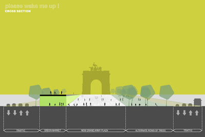
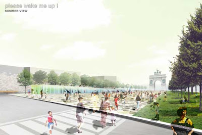
T1. Please Wake Me Up
“Traffic is “squeezed” to the Plaza’s spine, allowing the berm areas to reconnect with surrounding residential neighborhoods. A generous, open, urban square bridges the gap between Park and Plaza, and offers a sense of tranquility and expansiveness. A market hall becomes the greenmarket’s year-round home.”

:: images via Design Trust for Public Space
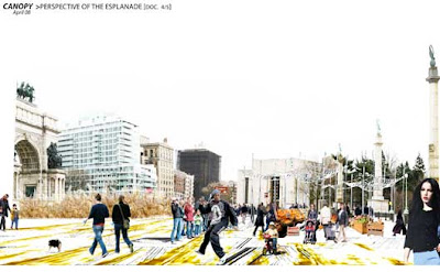
T1. Canopy
“Canopy” stands for a strategy of spanning different areas and uses with a connective or sheltering roof. Green ‘canopies’ or roof-decks bridge over Flatbush Avenue, which becomes the main north/south vehicle route, freeing the west side of the Plaza for other uses. Canopy-shaped forms become community gardens at the west berm, and a canopy-shaped pool surrounds Bailey Fountain.”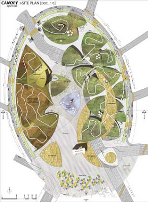

:: images via Design Trust for Public Space
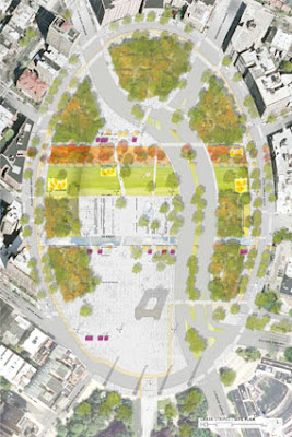
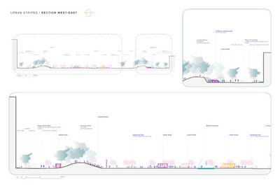
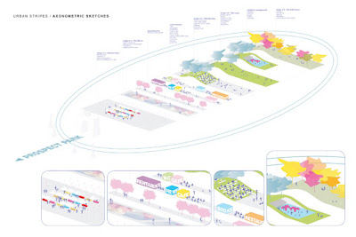
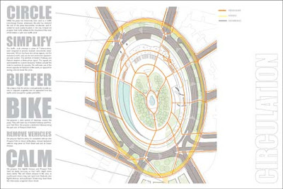
2. Urban Stripes
Vincent Hertenberger, Andras Jambor (Paris) — “Grand Army Plaza is divided into five east/west ‘stripes,’ connecting communities on either side of the Plaza. Each stripe has a distinct appearance, plant community, and use. The Plaza’s center becomes a large, paved public space, with a pedestrian crosswalk, which repositions the Plaza as Prospect Park’s formal entry.”

:: images via Design Trust for Public Space
3. A Center for Brooklyn
James Garrison, Brandt Graves, Simon Kristak, Vanessa Moon, Tim Peterson, Sal Tranchina, Aaron Tweedi, Darshin Van Parijs, Elliott White from Garrison Architects; Michael King from Nelson/Nygaard (Brooklyn, New York, USA) — “A wide center Plaza is created by pushing all traffic to a broad, tree-lined circular boulevard that replaces the berms. The expanded center becomes a platform for a range of community activities, much like Union Square or Bryant Park. An elevated pedestrian promenade circles the Plaza, provides views, and connects the Plaza’s many elements.”

:: images via Design Trust for Public Space
Also, as an extra bonus, check out the 30 finalist proposals for some additional info as well – on the people’s choice voting site (although voting is closed). Contrary to the typical response of competitions, the broad distribution of a number of non-winning schemes allows for some interesting additional viewpoints, not just the winning proposals.




This is a very site analysis. What kind of software do they use in drawings like that?