I have a folder where I keep upcoming items to disseminate in the intermittent Veg.itecture series – and it usually tops out at 15 or so items before I get around to a weekly or bi-weekly compilation – which make for a somewhat lengthy but manageable post. In this case, today I noticed 50+ items in this folder – which even excludes some of the recent posts of major Veg.itectural project such as the California Academy of Sciences Building, the work of Patrick Blanc, Hundertwasser, a trio of green projects, and some Neo-Vertical Greening to name a few.
So how to deal with such a dilemma? Aside from pulling together an upcoming guest post on WebUrbanist about Vegetated Architecture (stay tuned for that) – I guess it’s just time to dive in – perhaps spanning a range of posts over the next week. Where to start? I’ve been going through a phase of home-envy, so this first project is a really cool one on the NY Times which came via ArchNewsNow for a very green penthouse apartment in NYC – both inside and out.

:: images via NY Times
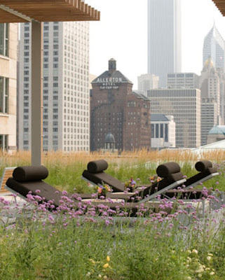
And a sexy Chicago rooftop garden (i.e. not a green roof) at The Residences at 900 via Jetson Green provides shared amenity space for, I’m guessing, the residents?

:: images via Jetson Green
I don’t know if this one is actual vegetated architecture – I just really like the image of Logroño Montecorvo Eco City, Rioja Province, Spain by MVRDV – specifically with the hillside floating up behind the building.

:: image via WAN
Another non-veg example this reminds me of is a recent post from Arch Daily that makes use of the borrowed views of adjacent hillsides at the Glass bottling Plant Cristalchile.

:: images via Arch Daily
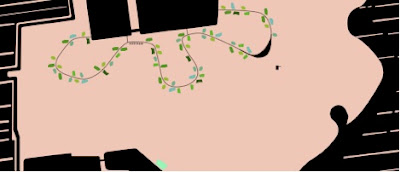
Back to the actually vegetated projects – here’s some greenwashing at the Nanjing China HQ of Chevron by Perkins+Will. Via WAN: “The architecture represents this process by emphasizing the intersection of the contemporary and traditional. It symbolizes this intersection of global and local by reinventing the vernacular in a contemporary context. …The zig-zag contemplative path found in traditional Chinese gardens serves as the organizing device for the departments of the headquarters which are broken into five distinct wings. A sloping green roof unifies the massing of the five wings and also covers areas to form roof terraces for employees.”
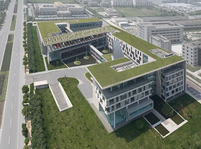
:: image via WAN
One of the more strange examples of vertical greening via Treehugger – a development of green clad floating homes made with recycled polystyrene RexWall.

:: images via Treehugger
BDonline with a blink-or-you-miss-it external green wall next to an entry canopy for a development in the UK, from a project by Pelli Clark Pelli.
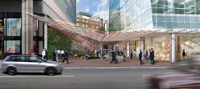
:: image via BDonline
And I really like this one from the Parisian La Defense Generali Tower – with some vegetated notches in the facade, via World Architecture News. From the distant views, the only disappointment is there isn’t enough of these to really make a significant impact on the facade… the seem like a tacked on afterthought.

:: image via WAN
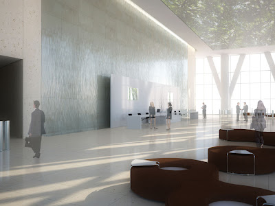
Even more stunning (at least in representation), is the lobby space with vegetated atrium.

:: images via WAN
A smaller-scale example shows a gem from anArchitecture features the Japanese Pavilion at the Venice Biennial shows the simple structures in illustration and reality: “The pavilion’s exterior is surrounded by 1:1 buildings of greenhouses, an attempt of realizing an idea of the pencil drawings. “These buildings, which are designed with precise structural calculations so they are just barely able to stand, suggest the future possibilities of architecture and therefore pose the basic question: What is architecture? They are extremely delicate greenhouses with an ephemeral physical presence that blend into the environment.”
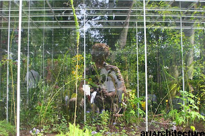
:: images via anArchitecture
And in a final meshing of some interesting visuals – I thought the 56 Leonard Street/HdM project in New York was pretty cool in a Jenga-esque sorta way – but this image kinda cracked me up. The sculpture, by Anish Kapoor – looks like a replay of the Millenium Park Bean (i.e. The Cloud Gate) that had this building unfortunately landed upon – as well as a remnant snippet of the Caixa Forum living wall in the background on the adjacent building.
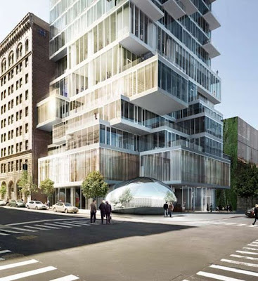
:: image via Archidose





Wow and strange…there is something very philosophical about how the Parisian La Defense Generali Tower integrates the vegetation into the facade. The placement inbetween the cross framing and the its location at the corner of the building emphasize the juxtaposition of architecture and nature. The vegetation becomes a piece of the interlocking facade, not a veneer. Other projects have taken similar approaches, but the way the Parisian La Defense General Tower mimics the shape of the industrial steel solidifies the concept.
-Claire Marie
Spot on Claire… I think it’s a pretty cool detail that may even be more powerful on a smaller building – carve away the corner of a 6-8 story building and that detail that gets lost on this structure becomes downright iconic…
But you can’t satisfy everyone… Read another way, as Arch.MNP aptly put it… “But even still, the building looks as if it’s unsure of what it wants to be – and that that uncertainty has somehow caused it to form legions on its facade. Go big or go home, my ninjas – carve out a corner/side of the building, or leave things be.”