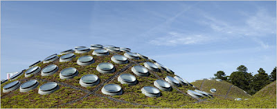
In Part 2 of our coverage of the California Academy of Sciences Building – we hit the NY Times coverage,and a review from Nicolai Ouroussoff that reinforced the thought of the week it seems: “… if you want reaffirmation that human history is an upward spiral rather than a descent into darkness, head to the new California Academy of Sciences, … Designed by the Italian architect Renzo Piano on the site of the academy’s demolished home, the building has a steel frame that rests amid the verdant flora like a delicate piece of fine embroidery. Capped by a stupendous floating green roof of undulating mounds of plants, it embodies the academy’s philosophy that humanity is only one part of an endlessly complex universal system.” 
:: image via NY Times
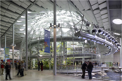
I’d call that praise, and it goes on, and it’s well deserved. Check out the article in full… and well, I just have to show a bunch more photos from the NYT Slideshow. How many projects are that beautiful on open day, may I ask? Continuing on with the article: “Glimpsed through the concourse’s grove of sycamores, the science academy gives the impression of weightlessness. A row of steel columns soaring 36 feet high along the facade lends the building a classical air; the sense of lightness is accentuated by a wafer-thin canopy above that creates the illusion that the roof is only millimeters thick. It’s as if a section of the park carpeted in native wildflowers and beach strawberries had been lifted off the ground and suspended in midair.”
:: image via NY Times
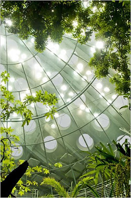
In this stunning slideshow of images from the article… the beauty continues inside and out. Ouroussoff continues: “The base of the planetarium sphere floats in a pool; a broad ramp snakes around the rain-forest sphere. Enveloped in gnarled branches, the ramp seems to have been swallowed up by the jungle landscape over millenniums… Once you reach this point, the genius of the green roof’s design becomes apparent. The mounds of earth visible on the exterior turn out to be hollow: their forms, punctured by round skylights, bulge upward to make room for the giant spheres underneath. It’s as if a lush protective rug has been gently draped over the entire building.”

:: images via NY Times
There’s been grumbling about the so called aesthetic deficit in green and ecological design. It’s not a discussion without merit, but this project should put to rest many of the issues, at least with the potential for green architecture. A half-billion dollar budget, amazing collaborative design team, and the support of owners throughout the process doesn’t hurt – but the overall conceptual idea is the same, as Ouroussoff concludes: “The ethereality of the academy’s structure suggests a form of reparations for the great harm humans have done to the natural world. It is best to tread lightly in moving forward, he seems to say. This is not a way of avoiding hard truths; he means to shake us out of our indolence.”
I’d say in terms of green architecture, things are looking up.

:: image via NY Times

