Competitions allow some interesting opportunities. One is the ability for firms to shape up against one another in at least an equitable showdown. Another is that it gives some opportunity for firms to either experiment graphically or flex their artistic muscle.

:: Hargreaves Design featuring curled overpass – image via New York Post
In a recent announcement of design solutions, via the New York Post, envisions a “…new boulevard and park planned for Manhattan’s far West Side, where Mayor Bloomberg wants to build a new business district more than twice the size of the World Trade Center complex… From fanciful images of hills, trails and plantings to a park filled with enormous evergreen trees and rock outcrops, the proposals from five teams of architects vying to design the park and boulevard will go before the public beginning today. …The project, part of the Hudson Yards redevelopment, will create four acres of park space down the middle of a boulevard stretching from 33rd to 42nd Streets, between 10th and 11th Avenues, and linking up with a massive new office and residential project planned for the West Side rail yard just to the south of the new avenue. “
The project by Work Architecture (along with Balmori Associates on the landscape side) definitely wins the prize for most inventive and whimsical graphics – with a colorful play-dough site model that definitely highlights the topographic nature of their submittal. 
:: image via New York Post
There’s also a local/regional project proposal from PNW powerhouse duo Gustafson Guthrie Nichol Ltd/Allied Works Architecture Inc along with PB Americas… strong team and interesting graphics – although it doesn’t say much about the design. It’ll be interesting to see the full proposals, as one image gives such a simplistic view of an entry and it’s concept.

:: image via New York Post
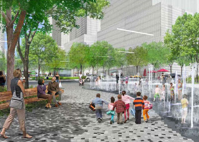
The submittal by Hargreaves Associates, along with Ten Arquitectos and James Carpenter Design.

:: image via New York Post
And the Michael Van Valkenburgh Team submittal:

:: image via New York Post
And finally, an image from the proposal from West Infinity.

:: image via New York Post
Is it me, or do the middle three kind of blur together? As I mentioned earlier, it’s tough to even make value judgements without seeing the entire picture, so I’m eager to see the full spectrum of solutions. Also, most of these firms are the expected players in an invited competition (with Work AC coming on strong this year). Personally, I’m not familiar with West Infinity, so definitely need to do some digging for more info there.
More to come, of course.
[note: edited 09.24.08]
Wow, that playdoh one is AWESOME!
Anymore the snazzy Photoshop perspectives are used so much that they aren’t even cool or inventive, they evoke about as much feeling as a photograph. It is good for showing what a place looks like but doesn’t necessarily evoke emotions or provide a specific mood at the same time. It gives an idea of the design but doesn’t really produce much aside from that.
But I see that model and I think…wow, I want to know more about THAT one. It looks fun and imaginative. Even though it doesn’t have every detail worked out, the “mood” says so much.
Yeah – it seems as if the issues of representation are always changing… and I agree there’s a certain artificiality to the photorealistic ones. On one hand I like more choppy pastiche that are not attempting for hyper-realism, but there’s a limit on any graphic where it degenerates into silliness that hurts it’s credibility.
The playdoh – although I like it – is venturing into that territory of the ridiculous…
Oh…I thought the design was going for silly 🙂
It looks to me like something out of a children’s story book.
That’s a good point… in striving for silly – which I think is fine… does it reduce it’s credibility as a viable option. What looks fun in playdough may not translate into some viable. I think that’s why imagery so often has that tinge of hyper-realism that more often than not looks a little too real to be interesting. Because it’s a sales tool, as well as art.
We’ll have to get some Work AC/ Balmori folks to comment when the entries are judged and they can reflect…