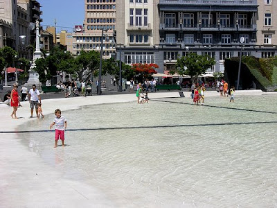
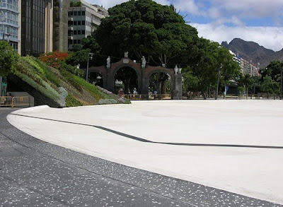
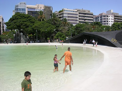
Spotted via Dezain, a link to a series of Flickr images from Herzog & de Meuron’s Plaza de España in Santa Cruz de Tenerife, Canary Islands.
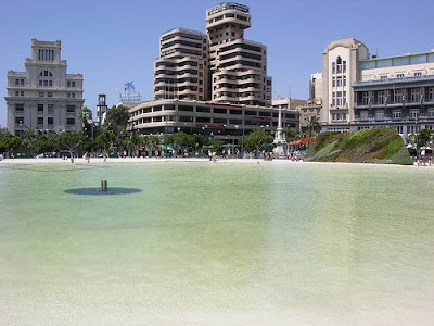
:: image via Flickr – garbar53
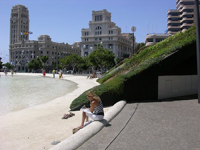
As mentioned previously, there is definitely not a shortage of architects flexing their muscles in the public space realm – from the landscape urbanist stalwarts of Tschumi, Koolhaas, and Allen – to the recent Nouvel exterior excursion. This space offers a variety of experiences – from the dark cave-like structure, to the vibrant Patrick Blanc designed green walls, to the ebbing central water feature. Here’s a few more pics on this visual tour:
:: images via Flickr – garbar53
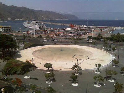
It is interesting, similar to the Parc del Centre de Poblenou the starkness of these spaces (although I’d give Nouvel the nod for vegetation density at least). While ostensibly dubbed a ‘plaza’, this seems to give opportunity for expanded hardscape specifically related to civic space. The harshness of the environment must be intense in hot sun when the water has receded from the central feature. Plus, the spaces are definitely ‘structural’, owing to the architectural roots – perhaps appropriate in an urban setting. There is a ring of trees, as well as the cave and the adjacent slanted green walls, but it makes me wonder if there is enough urban refuge to counterweigh the expansive pool?
:: images via Flickr – garbar53
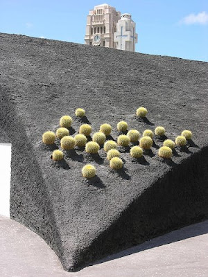
When filled with water, a totally different scene, one popular with children similar to the tidal Jamison Square here in Portland (although at a vastly different scale). Hands-down, my favorite detail is the pocket-planted cacti with the structure… giving some architectural flourish to a pretty contrasting dark structure.
:: images via Flickr – garbar53
Maybe just fuel for the ongoing debate… H&dM are a talented duo, and why not apply that talent to public space. Is it successful as site/landscape/non-building…? Perhaps so. Urban parks blend that combination of structural urbanity with usable spacemaking at a pedestrian and recreational-user scale. Would a verdant picturesque park be appropriate…? Hell no! Would a few more square feet of greenery and some shade canopy help…? I’d say yes. In this case, the scale seems off… too big, too grand, too sparse… something that at half the size would have been twice as good maybe? (Note: I don’t know much more about this project that what appears on the Spanish language Flickr page, so I’m pleading ignorance with any other team members, landscape architects included…)
