To preface the following, may I say I heart and cherish my tomes stack in an end table of McSweeney’s Quarterly – each with a different style and shape and format… some impenetrable, some trite – all amazing and wonderful literature. I love Dave Eggers work (with the exception of the ‘let’s be serious’ for a bit ‘What is the What.’) and devour each issue with relish. I will also add that when looking for criticism of landscape architecture works – I do look to the NY Times, but perhaps from now on will skip the op-ed contributions of McSweeney’s editors (or just those at-large).

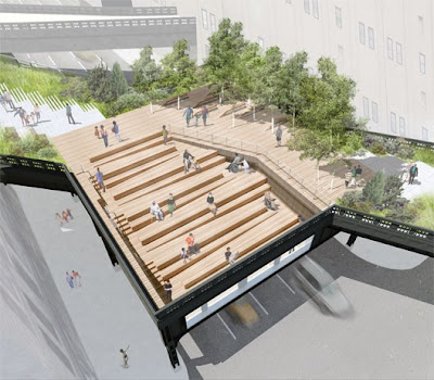
:: image via Curbed
Sean Wilsey penned the Op-Ed on July 9.2008 regarding his underwhelming take on the High Line designs – and while I don’t agree with every design move on the project, the criticism rang a bit hollow. While I respect one’s right to voice their opinion on the merits of public space, park design, or frankly anything – one must also understand the topic to a degree that warrants attention. All said, I’m going to assume it was satire, and skip any negative feelings that would make me dislike McSweeney’s…

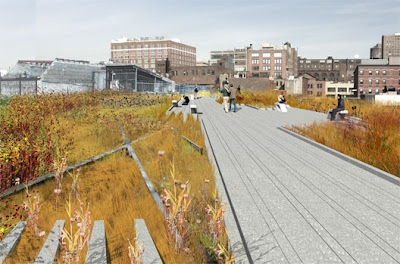
:: image via Curbed
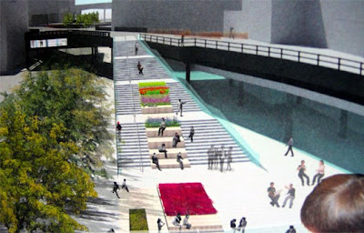
Some of the ideas are good – and part of the scheme, such as adding vibrant retail under the high-line, ala the Promenade Plantee in Paris or adding art exhibition space – making the open space a true public space with a cultural relevance as wedl. It’s not going to be just ‘grass and sumac’ – but includes a variety of plantings led by Piet Oudolf – whom is pretty far from banal in terms of planting design. I also agree it’s pretty cool in it’s present form. But a pasture with farm animals, snow-making machinery, roller coasters, slides from office windows however, are just cute throwaways (and Wilsey admits it, with a grain of longing) – or just plain silly. Anyway, it’s a disservice to characterize this as ‘middlebrow design’… in any sense. Look around the world (or the US to be exact) and find a million examples of true middlebrow design. This is not one of them.

:: image via Curbed
Will it be the best piece of landscape architecture… maybe. But perhaps one of the most restrained and innovative designs out there… due to the fact that it lacks the bullshit, PPS, placemaking ephemera that people equate with good design. It’s space, to use, enjoy, travel, and look upon. So, Sean… keep up the good work… love the McSweeney’s and whatever the editor at large does I’m sure is really great – but let’s leave the space and placemaking to the professionals… shall we? Once it’s done, we can see the glory of it all – and if it sucks, make fun of it all we want.