As I mentioned back in March – the application of art, architecture and other detailing can have a significant influence on how we express landscape and urban interventions. While many materials are somewhat specific to architecture, or are artistically used in ways that aren’t typically functional – there are some great examples that have real application in the landscape.
From Treehugger, some garden panels at the Victoria & Albert Museum’s John Madejski Garden. From Treehugger: “The screens are made from green recyclable plastic paving blocks, commonly used in construction all over China. They create a green and sumptuous looking series of free standing walls, similar to the screenings used in traditional chinese garden design. They turn a utilitarian material into something attractive and different.” Designed by up and comer Yung Ho Chang who is the “…Beijing-born architect studied in the US and established China’s first private architectural firm, Atelier FCJZ. His firm is concerned with “ecology, reuse, and historical continuity as ignited by contemporary conditions.”
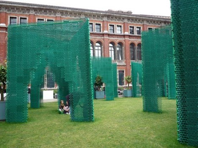
:: image via Treehugger
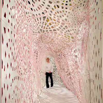
Another new example with a great form and a simple materiality from Dezeen – is the ‘Technicolor Bloom’ – a series of 1400 flat plywood panels that form a curved and perforated, and quite stunning, tunnel.
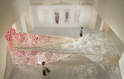
:: images via Dezeen
The name of the designer, Brennan Buck, definitely caught my eye. Not sure if it’s a coincidence… a landscape designer from Portland with that name from a few years back I met while writing an article for OregonLAND, the award-winning local journal published by the Oregon ASLA. Last I heard he was heading for academia… well maybe its him – anyway, nice work, whichever Brennan Buck was involved.
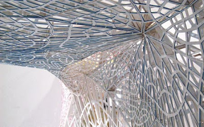
:: images via Dezeen
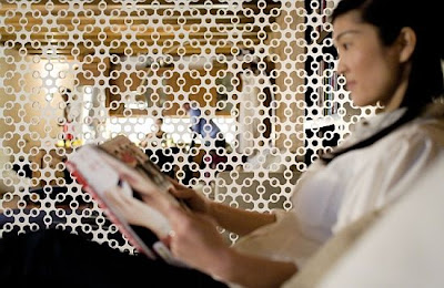
Continuing, we have a ‘curtain’… with some floral references
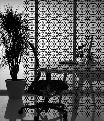
:: images via The Design Blog
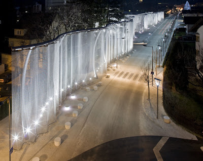
…and a ‘veil’ for an Austrian roadway with some mood ring aspects (via WAN)
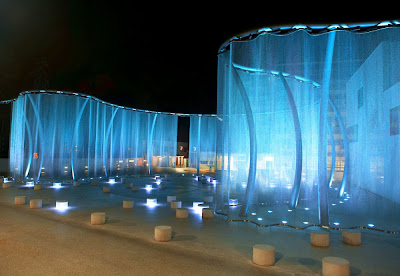
:: images via WAN
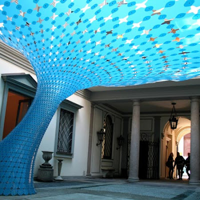
From Milan, via Dezeen, a fusion of light and material, Project Or, “…a vortex-shaped installation in a courtyard in Milan that reacts to sunlight. … The installation is made up of photo-reactive segments that are translucent when in the shade but coloured when exposed to sunlight.”
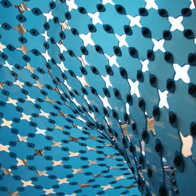
:: images via Dezeen
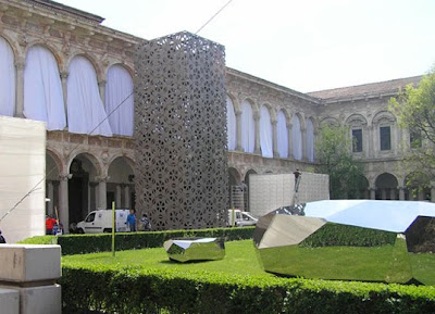
And more from Milan, some architectural ‘lace’ by Antonio Citterio.
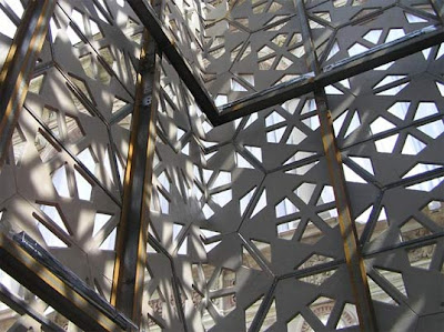
:: image via Inhabitat
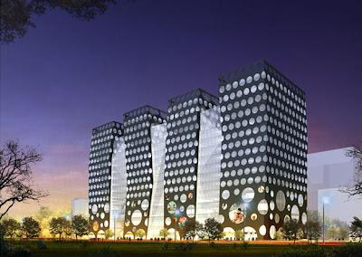
Switching it up to an architectural scale, there is a more simple, circularly perforated building massing for a building in Beijing. Guanghualu SOHO is functional as well as beautiful, via WAN: “The four 60-meter-high towers have what architect Ma terms ‘bright lungs’. Differing from many office buildings that have their elevators and hallways in the center, Guanghualu SOHO has its elevators and hallways next to the glass facades. The ‘dots’ on the facades and the ‘bright lungs’ bring sunlight directly into the building.”
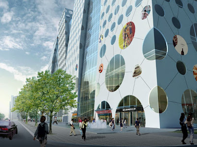
:: images via WAN
On a related note, one of my favorite office references for inventive materials is the book Transmaterial, by Blaine Brownell. There is a new version that emerged in January of this year titled, appropriately enough, Transmaterial 2 – but I have yet to get a change to pick that one up yet… the reviews are good – and the inspiration (along with these images above) just keeps coming.
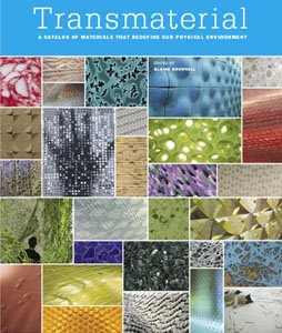
:: image via Archidose
Great work! Thanks… please check my blog