Time for another installment, and no slowing down of the Veg.itectural trend. As this phenomenon evolves it will be continually interesting to see the differences between the imagery that is presented in concept – and the actual project build-outs for these vegetated architectural creations. Starting with a recent post from my new favorite site, Arch Daily, the 2nd place competition winner for the CEA Cadarache Research Center by Juan Herreros Aquitectos.
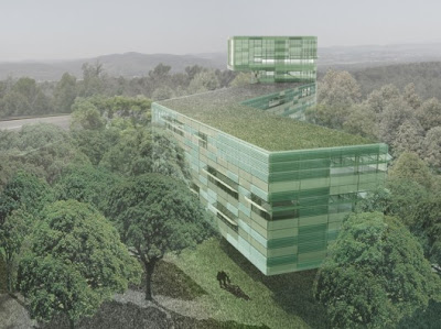
:: image via Arch Daily
From Arch Daily, an excerpt of the architect’s statement: “The project consists of five pieces of architecture located in a forest rich in biological activity. We have con-cluded of our visit to the site, that the best option is to inhabit the forest without exceeding their height, making architecture as a new species that respects, protects and enhances the forest, until create a new balanced system in which buildings and trees are sharing rights and obligations. With this we will not competing with the size nor the presence of a large reactor or reduce the value of the ecosystem of a wooded garden at the foot of the buildings.” The axonometric shows the surgical insertion of buildings into the wooded landscape. Be sure to check out a bunch more photos here…
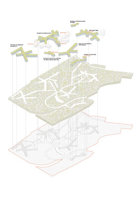
:: image via Arch Daily
Another 2008 competition, theWorkspace Group Urbantine Project showed a couple of the runners-up showed interesting ideas spanning the abstract to literal vegetative integration (via Bustler). An excerpt of the brief, via WGUP: “We want you to tackle the issue of rapid change in the 21st century workplace, such as the phenomenal rise in the use of digital technology and its impact on our work and office environments. Tremendous claims are made as to its possible effect on our communication, social interaction, mobility, productivity and creativity.”
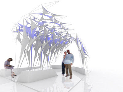
:: Ocean ‘Minimal Membrane Tent’, UK– image via Bustler
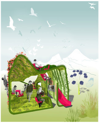
:: CGC ‘The Mountain’, Denmark – image via Bustler
And another via BDonline – the Urban Splash Lex Walsall competition – part of a mixed use development. A number of interesting vegetated details from the finalists.
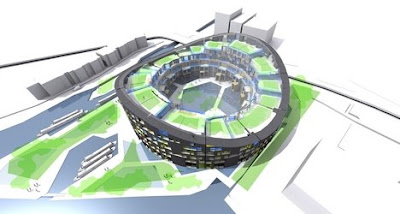
:: Kirkland Frasier Moor – image via BDonline
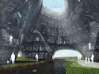
:: Jacobs Architects – image via BDonline
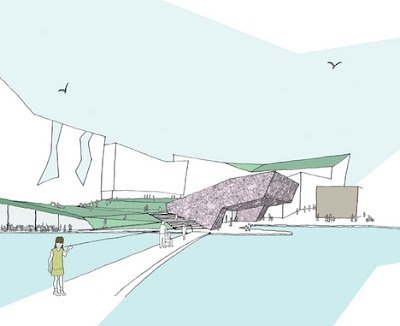
:: Flacq – image via BDonline
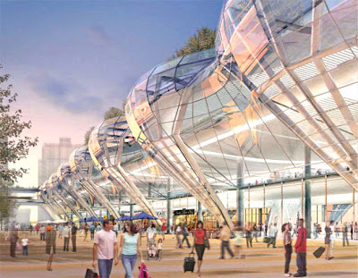
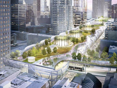
One I neglected to show back a few months when it hit the scene – Pelli Clarke Pelli Architects design for San Francisco’s Transbay Terminal. It’s worth a few pics. My favorite from Mad Architect‘s comment stream, if you scroll down a bit, was from ‘boyo’ with the astute and to the point – ‘my arse it will look like that’…
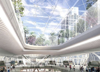
:: images via Mad Architect
And finishing with some smaller-scale examples, spanning the hobbitesque to the silly (is that really a continuum of any sort…) Enjoy!
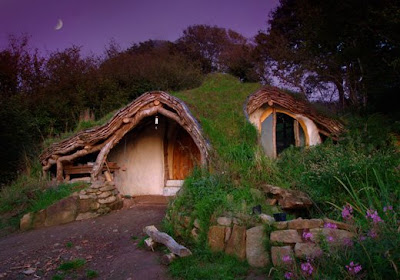
:: Maison Baggins – via Treehugger
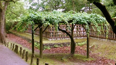
:: Green the Bus Shelter – via Life Without Buildings
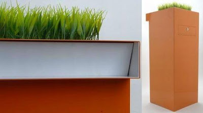
:: Green the Mailbox – via The Design Blog
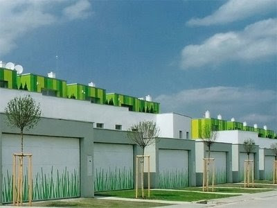
:: Paint is cheaper tha Plants – via anArchitecture
