As I made reference to previously, Steve at The Sesqui.pedali.st presented me with a digital copy of the article ‘Vegitecture’ by Michael Sorkin, published in the 1979 issue of WET Magazine. After a quick read (it’s 3 pages illustrated) and a warning from Steve that it had NOTHING to do with Vegetated Architecture, here’s my thoughts.
:: image via the Sesqui.pedali.st
Page one left me feeling confused, as much by the text as the illustrations of ‘building costumes’. It turns out Vegitecture in this context is a fictional interview with Malcolm Wattle, whom is a purveyor of a new style known as architecture minceur (which a quick translation defined as ‘slimness’). The most clear referent is the idea of cuisine minceur, which was a spa-based food fad in France which spawned the modern equivalent of Lean Cuisine. What it boils down to (haha) is a parable of food-based architecture – akin to perhaps an early idea of building integrated urban agriculture 🙂
“We do like to use fresh, natural materials whenever we can but they’ve gotten so terribly hard to find. Really, do you know any builder nowadays who uses really fresh tomatoes? … Everybody in the profession says today’s tomatoes don’t taste anything like they used to, but that if you’re planning more than three or four stories you need a really firm veg. and we are going to wind up having to make certain sacrifices in the flavor department.”
Using cutesy project examples such as Maison Almondine and the Garlic House, and using the food analogy as a parable for design critique? “But word is getting out. Every week students come to look at the Maison Pastrami and we have begun to hear quite a few favorable remarks. Knock-offs of the beefsteak baluster are beginning to show up in other people’s work. You know, the originals were grown right across the river in New Jersery.”
:: image via the Sesqui.pedali.st
Continuing on, the second page was rife with more metaphor – this time in terms of ornament… using the idea of clothing as the vehicle instead of vegetables: “What we said was that buildings should have larger wardrobes. Honestly, why should buildings dress the same all the time? … Heaven knows they can afford it.”
Alas the imagery on the first page starts to make sense draped in the clothing metaphor (hehe) – and the idea of static architecture is challenged through the idea of daily change. “It’s absolutely ludicrous to see so many buildings standing around on weekends wearing exactly the same boring checks and pinstripes they’ve been sporting the whole week long. The weekend is the time for fun!”
And this continues to seasonal change – with some reference to vegetation (vegitecture?) “As for spring, the coming of la primavera should be a major event in the life on any well-clad ediface. Trees and shrubs are a lovely touch, an homage to nature’s miracle of rebirth.”
The metaphorical romp continues, with reference to buildings showing ‘duct’. “We do like a building to be naughty, but that doesn’t mean expose everything. Everyone knows it isn’t sexy if nothing is left to the imagination.” and of the need to only address the building’s lobby… “Everywhere there should be gleaming stainless and potted plants; more than likely a ficus benjaminus, perhaps perched upon a piece of fuzzy camel-colored carpet with a little knot of Barcelona charis clustered nearby — never sit on these chairs, they’re only there for show!”
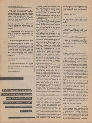
:: image via the Sesqui.pedali.st
The final page was mercifully short on text and long on disturbing illustrations… making for a climatic ending of quick and random question and answer. An example: “How should a building act?”… “We do like a building to be friendly but also like a building to be rude. So let’s see some saucy false noses! Why not goose the building next door! If a building is really going to be good, somebody’s view has got to be blocked.”
Ok, so I get the architectural critique and thinly veiled dissing down the jabs as firms doing blah design “…As to color, flesh tones are very, very big. As a matter of fact, there are some thrilling offices here in town (I think you know who we mean!) buying prismacolor in just that one fabulous hue.” That’s the kind of stuff you say to colleages over a beer and never in print. So kudos to Mr. Sorkin.
Furthermore, I’m not sure if the random typos, reprints, and misspellings are just a funky part of the magazine or just bad editing – but it’s more zine-like than fine writing – which makes the message even more powerful – coming from the underbelly – not the establishment. And how many articles can get away with gemslike this? “There’s only one shape for skyscrapers and we think you know what it is? Give you a hint: It’s naughty! So learn from what almost half of us have in our pockets, learn from the Chrysler, learn from the Empire State, learn from Arnold Schwarzenegger!” and… “An iron lung is a machine for living. A house is a place to have a good time.” Classic!
And finally, the term Vegitecture seems safe to redefine in the modern world as a serious term… with apologies to the ideas of Sorkin. This portmanteau, if you will, of Vegetation and Architecture, while alas not wholly original – at least can be somewhat new.


