It’s spring, and there’s been a bumper crop of vegetated architecture examples from around the globe. I’ve been neglecting the posting – and now they’ve piled up into a major collection of projects – and it’s inevitable to be a multi-part series of Veg.itecture posts to get all of the great projects in there. So, here goes.
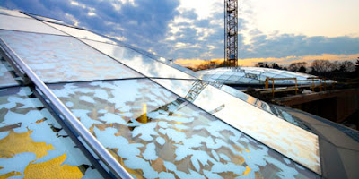
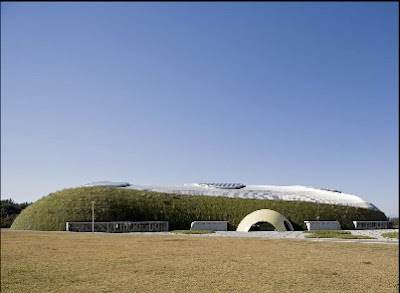
First out of the gates, a tennis dome/distaster management park (there’s a combo) in Japan, designed by Shuhei Endo – which is clad in green wall to complement the organic form.

:: images via Treehugger
As Endo points out, via Treehugger, the use of organic vs. euclidian form is purposeful: “Square buildings are too strong,” explains Endo. “Rounded, curved forms are more continuous and blend in better with nature.” No where is this more true than the final pic above of the entry – a bright yellow tennis ball shape that screams enter…
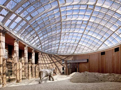
Continuing on, a similar idea of organicism with a different twist, a variation of using vegetated forms and patterns that evoke habitat, the Elephant House at the Copenhagen Zoo, designed by Foster+Partners, is geared towards the particular habitat needs of it’s residents… including spatial arrangement for some alone time, as well as a canopy-esque fritted glass enclosure that provides a hint of dappled savannah shadows. More info via Dezeen.

:: images via Dezeen
A variation on Dutch amphibious architecture, the garden barge is a way of extending green space beyond the water’s edge – and also make it mobile. Treehugger offered some views of these floating gardens in London, particularly Garden Barge Square, as one of stops on the London Open Squares Weekend.

:: images via Treehugger
Another couple of smaller projects via World Architecture News – showning the definite trend towards greening buildings in a variety of stylistic, and somewhat functional ways. First is the Berkeley Art Museum and Pacific Film Archive from Toyo Ito – with an egg-crate aesthetic and tiers of roof ‘garden’ along the facade.

:: images via WAN
Another example from WAN is by EPR Group Ltd. for a mixed use assemblage at Croydon Town Centre in the UK. A stair stepped building with roof terrace is a compelling image from within and from the ground level. More intriguing is the overall plan which contains a range of extensive and intensive rooftop spaces – all woven into a patchwork of greenery through the urban fabric.

:: images via WAN
The final WAN example is some rooftop vegetation tidbits on the New World Symphony building in Miami Beach, which tops a, well, Frank Gehry building of tumbling shapes. I assume this is a rooftop terrace, and the project is adjacent to a new 2-acre park as well…

:: image via WAN
Finally, spanning urban ag and veg.itecture, and a whole different theme – a bit of corporate green washing via Treehugger, with a living sign from McDonalds: “Fast Food News … says “the creative team worked closely with a horticulturalist to create a billboard that could start with 1½-inch spouts and grow into lush leaves. The garden appears to be safe from being plucked apart by birds because there is no place for them to perch and peck.”
Yummy, but I’m still not going to McDs… 🙂

:: image via Treehugger


