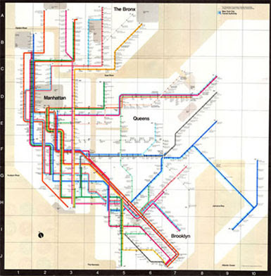
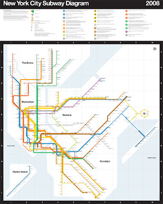
For the record, I don’t read Men’s Vogue on a regular basis – no offense to the magazine – I just am already overloaded with periodicals so need to focus. So I was pleased when The Men’s Vogue Web Team sent me a link to a recent story on the updates to the iconic 1972 NY Subway Map designed by Massimo Vignelli, as well as a pictorial evolution of the map over the years… as a certifiable map geek – I couldn’t resist.
From Men’s Vogue: “Massimo Vignelli’s 1972 New York subway map was hailed as an instant graphic design classic. After recently updating his famous diagram, Vignelli signed 500 limited-edition prints that were available exclusively through Men’s Vogue. While the signed version is sold out, unsigned maps are available for free within May 2008 issues of Men’s Vogue at select retailers across the U.S.”

:: 2008 NYC Subway Map – images via Men’s Vogue
The new map is sleek, sexy, and appropriately styled for the NY urbanite… OK, I’m starting to see the whole Men’s Vogue connection. But New Yorker’s don’t carry maps, do they? This isn’t communication – this is art and style in manly map form. It’s also a graphic design and cartography history lesson to see the evolution of the years of the maps… definitely check out the slide show for all of the maps and some interesting dialogue about the evolution of the graphics – here’s a taste:

:: IRT Map (1905) – image via Men’s Vogue

:: IRT Map (1924) – image via Men’s Vogue
In 1940, the two subway lines were unified, making a much more geographically broad and dense map – that included more detail of the outer boroughs. These maps still had the more locational and scaled traditional map quality.

:: Unified Map (1948) – image via Men’s Vogue
This dense amount of data led to more graphical examples, such as the one seen here from 1967 – which began to abstract the shape and landscape to accomodate a more easily organized system of information. This is an interesting phenomenon – as mapping no longer had to be tied to place and became a touchstone for development of more abstracted mapping. Via Men’s Vogue: ““Now we have a map that is a dull distorted gray mess,” wrote rider Peter Rosenblatt to the New York Times in 1959. “The whole thing is a neat job of camouflage.” Salomon’s color scheme was quickly replaced, but his approach of simplifying the city and foregrounding the train lines caught on.””

:: Map of New Lines (1967) – image via Men’s Vogue
:: Current Map – image via Men’s Vogue
The current map is more of a fusion of geographic scale and pictorial abstraction. I have a copy of this map at home as well as one of my favorites – not a subway map, but a pop-up version of Manhattan, which you could hold in your hand and expand to get some additional information. Other than the sheer inventiveness of the idea – I loved the fact that it allowed me to be covertly hide my tourist-status while not getting lost… priceless in a City where affect is everything.
Maps are interesting – as they are a fusion of design and communication – as well as a contentious and evocative pictorial story of place. Thinking back to settlement, or perhaps the potential Mannahatta of old – we get a glimpse of how much the concept of place is tied with topography, history, and usage. One quote from the Men’s Vogue article sums up the idea and conflict between this design, reality and communication:
“When Massimo Vignelli was hired by the city to redesign the subway map in 1971, he was known principally as a designer, not a cartographer. His approach — simplicity through geometry — reduced New York to its essence. Vignelli straightened out bent subway lines, reshaped the city, and even rearranged roads, putting the stop for 50th Street and Broadway west of 50th and 8th for example. “Of course I know Central Park is rectangular and not square,” Mr. Vignelli told the New York Times in 2006. “Who cares? You want to go from Point A to Point B, period.”

:: Central Park Squared – the 1972 map – image via Men’s Vogue
