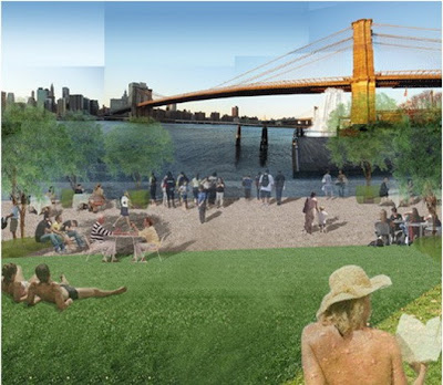
An exclusive from Tropolism shows a park/viewing grounds for the previously featured project NYC Waterfalls by artist Olafur Eliasson. Via Tropolism: “The Brooklyn Bridge Park Conservancy asked dlandstudio to develop a temporary park for the waterfalls. On a Brooklyn budget! Dland’s design includes wide swaths of color painted in stripes over the asphalt to create both a more comfortable walking surface for pedestrians and add color and texture.”
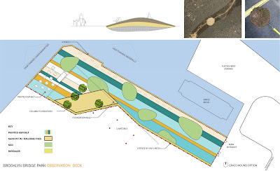
:: image via Tropolism
This temporary ‘park’ offers a glipmse of the future park, as well as the art along the bridge. “The design is like a pop-up shop for the future Brooklyn Bridge Park on the waterfront. The park includes grass mounds for lounging (the future park will be lots of mounds), a sand area retained by wood beams with umbrellas for shade, and our favorite, hay bales that get seeded and grow grass like a chia pet as the summer progresses. The pop-up park is going to invite people to use the former warehouse-blocked waterfront as a park, allowing people to discover vistas of New York that were previously blocked.”

:: image via Tropolism
The project is the work of dlandstudio, and some additional coverage by CurbedNY offers some more personal views of the temporary park. The concept of ephemeral spaces are fascinating – offering the ability to both provide viable open space prior to the actual park implementation. The other idea that I think is worth pursuing – is the ability to try out uses and features, only to adjust and adapt them based on feedback and user observation. This may be a blueprint for potential park development – making for a more appropriate and informed final design.
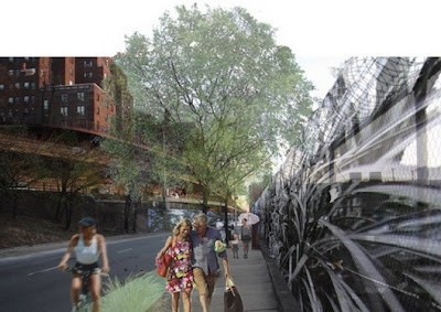
:: images via CurbedNY
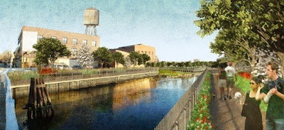
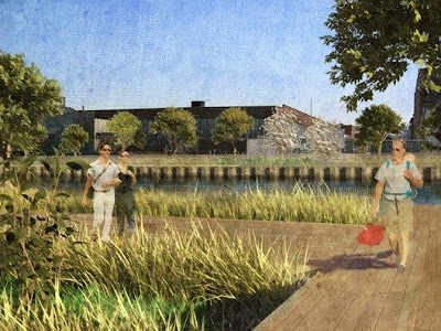
Another work by dlandstudio – featured on Curbed, is Sponge Park, which “…would be aesthetically beautiful while working to reduce the problem of contaminated water flowing into the Gowanus Canal. The plan proposes a continuous esplanade running the length of the canal (and extending into the neighborhood at certain points) and designs for the publicly-owned street ends and bridge crossings that would connect to this walkway.”

:: images via Curbed
You can tell a bit of the design intent, but I really like the style – sort of massively filtered photoshop to give it a softer, textural quality – much more successfully than the pop-up park drawings. Definitely an interesting firm to keep an eye on.
