A new crop of Vegetated Architecture from the world – from small to large, vertical to horizontal. For starters, a fav blog A Daily Dose of Architecture, with an archidose featuring one of my fav projects – “Tower Flower” by Edouard François.
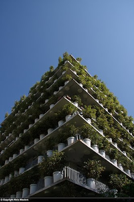
:: image via Archidose
Next I go again to the newish blog _urb_ (or archurbanist, either way, a blog after my own desires) with a great shot of a recent vertical planting – although I’m not so sure about the titles ‘veggicade’ and ‘fac(al)ade, but like the quote… “I’d like to add that gardens need not only inhabit the horizontal surfaces of our cities anymore! I found this little building at TU Delft last summer–I assume it is some kind of research project in green facades…”

:: image via _urb_

:: image via flickr (o d b)
Another more commonly seen (did I just say that?) is the large monolith with a sprinkling of vague trees atop. This one is from The Design Blog, for the Benidorm Casino Tower in Spain. Definitely a striking building form, but the vegetation is pretty weak – a smallish rooftop garden and some rooftop site insertion at ground level?
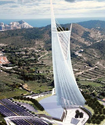
:: image via The Design Blog
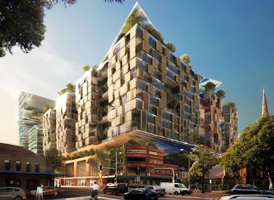
A more expansive, sustainable and successful (as well as quite stunning) example is slated to become the most sustainable development in Australia, Fraser’s Broadway, a mixed use project that will have contributing architecture from Foster + Partners and Ateliers Jean Nouvel amongst others.
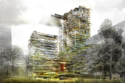
:: images via Inhabitat
Further information via Inhabitat: “The goal of the project is to achieve carbon neutrality. To do so, the intention is to achieve and explore every design method and technology that they can get their hands on from design efficiency, to the addition of green rooftops, smart metering and solar powered lighting in public spaces. Furthermore the project is intended to integrate with Sydney’s vision of the future by becoming one of the city’s “Green Transformers” – the project will be one of a number of energy generating and water recycling sites that will provide these services to their own developments and the areas nearby.”
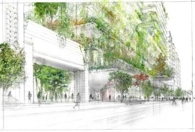
:: images via Inhabitat
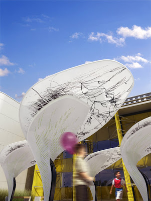
Next, a prototypically comprehensive look by Dezeen of the Solar Shade by Buro North, a high-tech yet simple shade structure with a graceful arching leaf form. 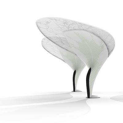

:: images via Dezeen
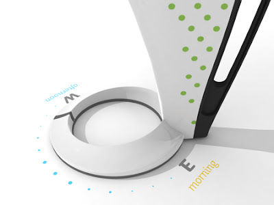
It’s a cool idea, and definitely very nice form. But not just a pretty face. From Dezeen: “The canopies have solar cells on top and large handles on the base mean that the canopy can be rotated by pupils or teachers to get the most efficient orientation in relation to the sun throughout the day. …It features a broad, uni-directional solar panel surface as a visible face for the structure. Most solar collecting structures position the panels on an elevated surface not visible from the ground, removing visual recognition from the audience.”
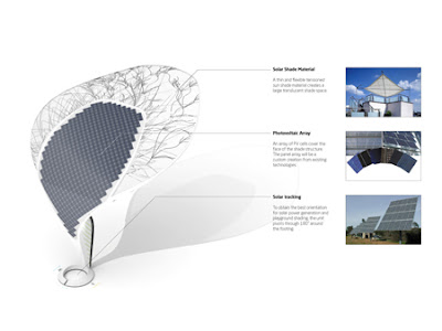
:: images via Dezeen
Continuing: “The structure is rotated throughout the school day to best suit the position of the sun. Markings around the circular base indicate best time-specific direction for shade in the morning and afternoon. The large handle on the shade allows for smooth rotation by children and adults.”
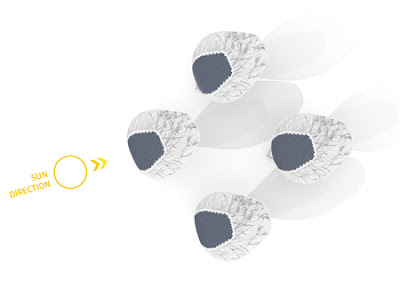
:: images via Dezeen
And a subtle transformation from night to dark provides a point/counterpoint of daytime whimsy and nighttime elegance, necessary of all furniture, functional or not.

:: images via Dezeen
Finally, via BDonline, this new proposal for Maggie’s Cancer Centre in Oxford takes the cue from the tree house, as the structure ‘floats’ above the ground plane amidst trees. The columns of the building blend with the tree trunks, allowing for an immersion in nature that is beneficial for cancer patients, staff, and visitors.

:: image via BDonline

