It’s been some time since I’ve delved into materials – specifically looking at inventive facades (of the non-vegetated type). A few recent examples are pretty good examples of materials that provide some unique articulation and function – that could also be adapted readily to a number of alternative uses.
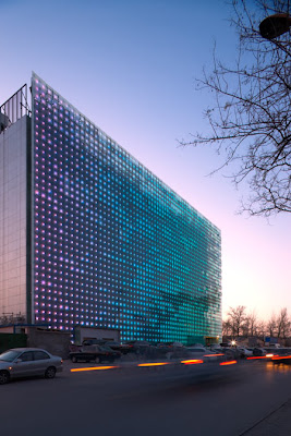
The first provides a LED media wall designed by Simone Giostra & Partners. The carbon-neutral Greenpix media wall is part of the Xicui Entertainment Complex in Beijing, China. Power is supplied via solar, which is collected during the day to operate the lighting in the evenings. The LEDs are larger-scale, resulting in not specific imagery but more abstract visual qualities of color.
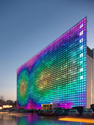
:: images via Dezeen
The logical next step is obviously mood facades which denote a color based on some sort of metric – perhaps the quality of entertainment inside, or maybe in your office – the emotional temperature of your boss – telling you perhaps to take a little longer lunch break. Or seriously, perhaps current projects of urban heat islands, global warming – or cues to other environmental concepts could be projected on the building facade.
Next is a more subtle and natural variation from Angela Fritsch Architekten. Spotted first on Atelier A+D, this project fulfills my love of abstracted vegetated forms, using a sharp relief stamped into what looks like metal panels on the facade. The idea of interesting form alongside dappled light is reminiscent of one of my favorites, the Tattoo House as well as other facadist variations using landscape forms.

:: images via Atelier A+D
Another variation in glass is via The Design Blog, and the Graz Music Theater, with a patterned facade that provides interest as well as varying opacity to interior space.

:: image via The Design Blog
And, well, what would a post about facades be with the requisite rusty steel, courtesy of eye candy. This particular model is from ssm architekten ag. Regular readers will be familiar with my Serra-esque love of cor-ten – and it’s many uses in architecture and landscape. A project here in Portland is using this on the facade as well, so stay tuned for some pics soon, as it is just reaching completion. For now, this one is yummy.

:: images via eye candy
Definitely no shortage of examples – and a new e-book really captures the obsessive quality of this idea. Piel.Skin is inventive for both is comprehensive and focused look at building facades of many, many types as much as it is a great idea of a online book format. As someone whom hates online books, this even kept me engaged. A sampling below:

:: image via Land+Living
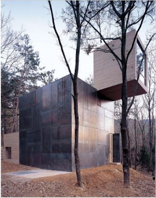
:: Element House, South Korea – image via Land+Living
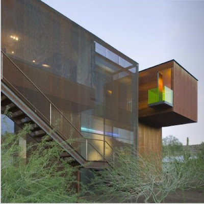
:: Xeros Residence, Arizona – image via Land+Living
Always a fan of form and function, a recent post from Inhabitat featured a ‘Smog Eating House’ which featured a: “…flowing fusion of glass … photo-catalytic concrete, creating a series of separate yet structurally connected spaces. Italian architects Iosa Ghini Associati designed the residence to integrate seamlessly into its sweeping Mediterranean landscape, and its airy day-lit interiors benefit from a slick set of green features including adjustable solar panels, rainwater recycling, and a heat storage system.”
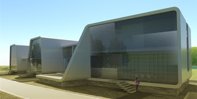
:: image via Inhabitat
I will have to do some more investigation of photo-catalytic concrete, but it’s reminiscent of the previous post on a vegetated building in London that used titanium dioxide to ‘eat’ the smog. This reminds me of a post in Treehugger that featured a range of Super-Porous materials being developed at UCLA and aimed at reduction of air pollution. The capture is one part of the equation – the storage and sequestration another… but at least it’s a step in the right direction.

:: image via Treehugger
So can we imagine the melding of many ideas – a blending of the artful facade, vegetation, and materials that provides the aesthetics, as well as a variety of climate-benefitting and pollution-reduction strategies on vertical surfaces dense urban areas. Looks like we are on the way.
