It’s been a wild week – and finally settling down to getting some posts that have been in process finished up and out the door. (That is, before heading back to work 🙂 Although Martha Schwartz would disagree, I’m still betting on vertical and horizontal building greening as a way of redefining landscape architecture for the future. So, with that, it’s time for some more Veg.itecture, with a new crop of building and landscape interventions.
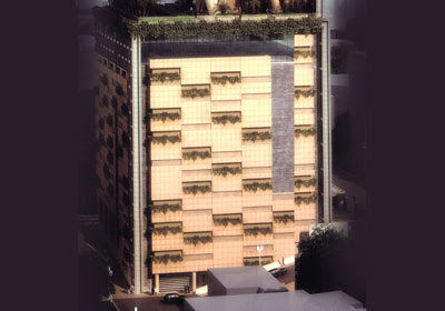
A project featured previously in preliminary form, the Antilla is now taking shape on the inside, and offers some interesting views of the green facade and terrace spaces. Featured in Forbes, the $2 Billion dollar price tag for this project has raised eyebrows but seem to have some potential sustainable goals (note: sustainable strategies does not a green building make). We can talk about scale and excess – but as an article in A/R points out – the efficient use of land is one feature that makes it less-impactings, than say, a 50,000 s.f. sprawling house on 5 acres in the suburbs.

:: image via Architectural Record
The gardens offer a variety of spaces for respite: “For more temperate days, the family will enjoy a four-story open garden. In profile, the rebar-enforced beams form a “W” shape that supports the upper two-thirds of the building while creating an open-air atrium of gardens, flowers and lawns. Gardens, whether hanging hydroponic plants, or fixed trees, are a critical part of the building’s exterior adornment but also serve a purpose: The plants act as an energy-saving device by absorbing sunlight, thus deflecting it from the living spaces and making it easier to keep the interior cool in summer and warm in winter. An internal core space on the garden level contains entertaining rooms and balconies that clear the tree line and offer views of downtown Mumbai.”
Forbes offers some interior views and details of these spaces in a slideshow as well… here’s a couple:

:: images via Forbes
A recently revealed project via A Daily Dose of Architecture et. al. is Five Franklin Place by UN Studio which is a condominium in New York City featuring a swooping facade of black ribbons and some punctuated vertical greenery.

:: images via Archidose
It gets somewhat more coheseive and interesting at ground level, where the ribbons are framed by more substantial vertical greenery.

:: image via Archidose
A recent competition offered some interesting vegetated solutions and graphics. As featured on BDonline, the competition for Bridewell Island redevelopment looked at a couple of different tracks of solutions – to rebuild or to build high. The winning entry by Allford Hall Monaghan Morris offered compelling restoration of the old, along with a great exploded axon describing the spatial arrangement and rooftop greening.

:: Allford Hall Monaghan Morris – image via BDonline
Some other runner-up entries in the vegetated realm:

:: Feilden Clegg Bradley Studios – image via BDonline

:: Spacecraft – image via BDonline
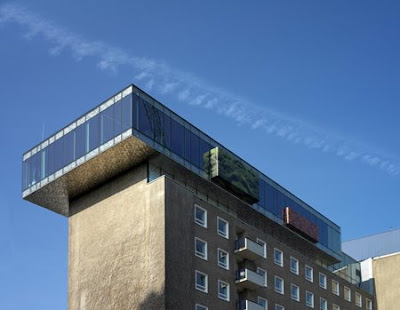
Continuing with an interior-exterior blending, a project from Dezeen in Amsterdam named Kinderstad is “…a penthouse where children being treated at an Amsterdam hospital can relax and meet friends, designed by Sponge Architects and Rupali Gupta in cooperation with IOU Architecture.” The exterior facade has natural patterns on the exterior titanium cladding.

:: image via Dezeen
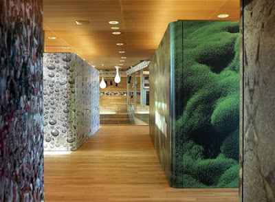
These elements protrude out, and continue inside for whimsical flourish of interior spaces: “With their playful prints of natural materials the boxes in the facade that stretch from the inside of the building through the glass facade to the outside give an impression of the thematic design of the interior and wear away the border between interior and exterior.”

:: images via Dezeen
And to finish up with some more whimsy, a flowery example of a shelter via The Design Blog with an bright and evocative natural form. “The steel flower has 11 petals that ascend synchronously around a central stalk. The latter creates the space within around which a stage rotates. The design is very versatile and adaptive. Not only can an entry be created through either of the different gaps in-between petals, but the looks can also be modified by changing the petals’ positions.”

:: image via The Design Blog
From a perusal of the links stored up, there will be another installment of Veg.itecture soon… check back.


I’m amazed at some of the designs that are being implemented. Absolutely beautiful! I think every home should incorporate plants and gardens to help absorb the pollution we create.
Dagny McKinley
http://www.onnotextiles.com
organic apparel