I try to hide my distaste or love for things landscape+urbanist in the quest for some sort of neutrality (um, ok, not really). Without critical evaluation and dialogue – we lack the capacity to expand our thinking and examine our interventions in ways that are beneficial to us individually and collectively. Or in short, we have taste, and like certain things, and dislike others. In this vein, I have a hard time controlling my joy of seeing anything done by West 8 both for it’s whimsical graphics and heady, but grounded ideas (read more about the firm and said philosophy here). This will be an on-going referential discussion about their work, so check back for more down the road.
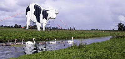
:: Cow – Horizon Project – image via West 8
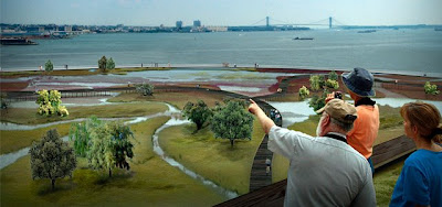
A recent competition win for W8 was the much publicized design for NY Governor’s Island… which had still competition from a number of high-powered multi-disciplinary teams. From an overview via West 8: “Imagine an extraordinary new public park that embraces all New York Harbor, its ecology, its history, its culture, its magnificent beauty. Surrounded by water, steeped in the natural and cultural history of the estuary, Governors Island will re-emerge as the next great “world park”: an icon for the city, a beacon in the harbor. West 8 proposed an extensive and coherent design for this 2nd park for New York.”
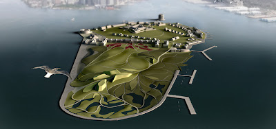
:: Overall Site – images via West 8
The following is a series of images from the competition, which I believe pick up on these threads of representational techniques that will, or likely already has, redefine landscape architectural communication. These are not necessarily West 8 creations (as others use them equally as often and well) – but it’s become one of the synonyms for edgy design/landscape urbanism for this type of technique.
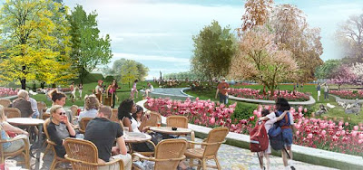
:: Governor’s Island – images via West 8
Gone are the soft-focus colored pencil techniques, or illustrative cartoonery that has so dominated the field and it’s expression. While not veering into the photo-realistic, these digital montages provide both evocations of materials, use, feeling, and most importantly – and actual place.

:: Governor’s Island – images via West 8
Ok, it’s obvious I’m smitten with the techniques, but let’s delve a bit deeper into some of these techniques. For instance, all of the following images look tacitly fake (i.e. representational). But, let’s look at some of the communication techniques. In the first image, there is the massing crowd, stage-setup that evokes the ability to gather and provide entertainment (i.e. revenue) and activity (i.e. success). Also, the background Statue of Liberty connects to place, and the smattering of vegetation (esp. the swath or red flowers, and craggy butte) connects this to other on-site activity zones. Finally the foreground shows us hanging out with some hip park users, with the dress and tattoo actually becoming implicit in the design of this space – design via the art and action of the inhabitants.

:: image via West 8
A more representational landscape is below, with somewhat abstrated fields of red amidst pathways. Hard to discern from a distance, the foreground clues into the vegetated monoculture that is forming these patterns. Also the user groups (humans=kids + families) as well as habitat (extreme foreground butterfly/moth).

:: image via West 8
A similar representation of the rocky crag pathway evokes a more determined park user in a verdant forest canopy, climbing the switchback path as exercise or climbing and sliding in a more playful manner. The stone, the lush ground plane, the overstory letting rays of light slip in – and again, the habitat butterfly pairs evoke nature as well as play and mystery, all essential landscape components.

:: image via West 8
Perhaps it’s less about place, as I previously mentioned, and more about experience. These series show context, design, use, program, flexibility, and ecology while being engaging. These are also devoid of some of the data-heavy diagramatic graphics that also populate a good amount of LU / competition imagery. This experience can be rendered for different users, times of day, and seasons.
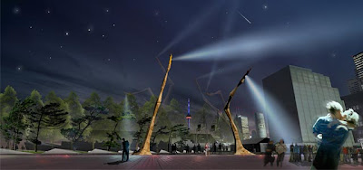
:: Jarvis’ Slip – images via West 8
While never far from originator Adriaan Geuze as a marquee headliner for the firm, West 8 has acheived some pretty amazing success as of late. Not that it is all the most fantastic design and theory in my opinion. There are probably better designers – and much more cogent theorists – but that it is more often than not edgy, thoughtful and meaningful. It will be interesting to see more work as it actually turns into real projects – and see if that can hold through the implementation process. Much like a beautifully rendered building that is underwhelming in reality – the build-out of these landscapes are subject to much more constraint as budgets, materials, and well, just plain reality kick in.
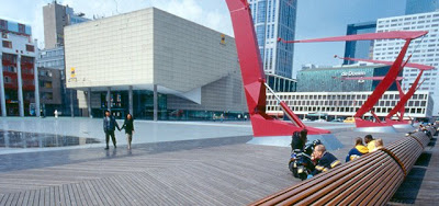
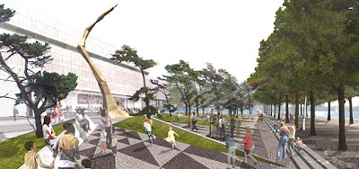
:: Schouwburgplein (1991) Rotterdam – image via West 8
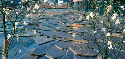
:: Interpolis Garden, Tilburg – image via West 8
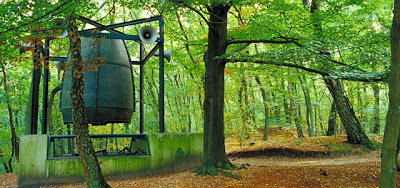
:: Kröller Müller Museum Scupture Garden, Otterlo – image via West 8
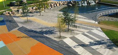
:: Chiswick Park, London – image via West 8
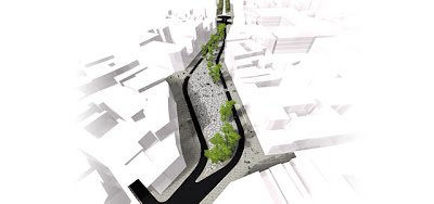
The previous showed a few examples of this via the West 8 website. There is definitely a disconnect between visual and physical representation, but I think these are definitely high-end build outs. To be clear this is not an overt criticism – as I have no referent for whether these are successful or not, but just that perhaps it is a double edged sword of landscape architecture that there is a disconnect between design illustration and physical implementation.

:: Falconplein, Antwerp (image + construction) – images via West 8
I can think of two reasons. Time necessary for growth, and constant evolution through seasons. Unlike a building, which arguably is not static, a landscape is NEVER static… and thus a 2D represetation of a snapshot in time is one milli-second in the lifespan. Paving is also something more immediate, as are structures, but landscape is tough to capture in any media. I’m sure you could capture the life of the renderings if you were patient… hovering around a space for many days waiting for these impromptu moments. But design wise- it is success, as these containers definitely make it possible. But more often than not, you will find organic use, growth in various stages, and well, flexibility.
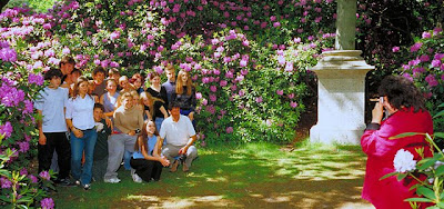
:: Kröller Müller Museum – image via West 8
What sent me along this path of West 8 adoration were a few recent sources. One was the recent publication of West 8 in the AD Landscape: Site/Non-Site, as well as my getting my hands on their latest monograph. Also, a poignant moment was some analysis by the super-observant and always compelling Eikongraphia. The site took on some of the work of West 8 in terms of symbolic representation (landscape as icon) and it made me re-evaluate some of my earlier knee-jerk reactions with some new understanding.
Stay tuned for more about these sources and aspects of West 8 and their work in coming weeks…

This is an excellent walk through some of West 8’s work.
Yes, I also find it difficult to quantify or measure the success of landscape. How can you ever say if it’s “done” when it is a continuously evolving process? How will the reality ever compare apples-to-apples with the design?
Friends and I were lamenting yesterday how poorly paid the design professions are compared to other professions (law, medicine) and suggested that perhaps it’s due to design’s lack of an obvious provable ‘end-point’ of success.
I’m looking forward to the next post.
Thanks Dan. I took a look at your blog and will add it to the sidebar links – a lofty goal to be the landscape aggregator! These are the questions that keep me up at night – but I think with the unknowns come the mysteries and happy accidents we can’t foresee. It’s interesting as we trend towards more flexibility and adaptability – this end-point becomes less and less clear. Good in one case that we are realistically acknowledging time and evolution – bad in the sense that it’s even harder to quantify a ‘product’. Definitely more on this.