The methods of representing vegetation on buildings is of vital importance to the acceptance and further expansion of the concept. I’d dare posit that it’s also a strategy to create excitement as well as enough realism where this doesn’t lead to disappointment when the project is build. In this vein, some representation of projects – via digital, analog, and in-between techniques.
A simple and effective example by Diller Scofido + Renfro shows a hybrid drawing computer collage that is striking – especially the ability to defy gravity a bit by jutting off the bottom of the page for the pool area. This image really got me thinking about the topic, due to it’s combination of old-new/digital-analog – but in essence more storyboard than drawing – essential design communication.

:: image via Brand Avenue
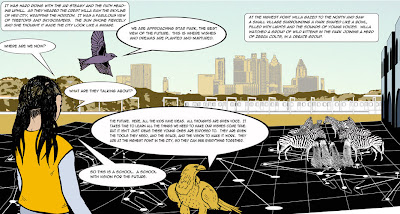
This touches on similar thematic ideas in ‘Willas Wonderland’ by LOOM studio, et al. (recently covered by architecture.MNP, previously by others, most comprehensively BLDGBLOG, per usual) which straddles storyboard/graphic novel with storytelling: From Loom Studio site:
“Thinking of our comic book as a model for reality, we know every community needs a vehicle that joins and carries many voices, many visions and many hands. These must be carried forth with human perspective in the context of actual human experience. Large projects are often developed in cities where rational economic and executive force usurps human comfort, practicality and beauty. Bird’s-eye planning rarely addresses human perspective from the street. Every city has need for humane stories, woven into the fabric of daily life and the places that nurture and inspire. A child’s perspective is often the most honest, pure and accurate.”
:: Star Park (from Willa’s Wonderland) – image detail via Loom Studio
A fusion of sorts, and more design than cartoon – but equally compelling are the graphics of the proposed Ronchamp expansion by Renzo Piano, with a simple graphic transition to section view which I think is just pure design poetry:

:: images via architecture.MNP
Curbed LA offers a North Hollywood school, with some aptly old-school plan and model shots of rooftop spaces for NoHo’s Ark – a charter high school focusing on architecture, engineering and construction management:
:: images via Curbed LA.
I’m still amazed people still do physical models in our digital age – particularly realistic versions versus massing or monochromatic building forms – just because they look so bad. As we’ve discussed previously, there are few available graphic techniques to appropriately depict plant materials, and the model-train set kit is definitely not up to the task, in similar wasy that paper and digital methods are. They look like crap.
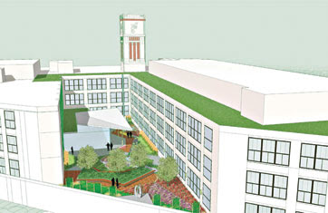
In some ways, it comes off as even less successful in certain paper techniques. I’ve ranted before about the bad SketchUp model – but there’s also the case of the vague depictation to give the feeling of vegetation without actually giving a clue as to what it really will be. These are better, but a good case in point, the rendering of a Tesco store by Allies & Morrison (above), and a proposed building renovation in Chicago (below) showing courtyard and rooftop green and color with little actual meaningful detail:

:: image via BDonline

:: image via Chicago Journal
This is further reinforced and combated with a variety of graphic techniques – not making an attempt to provide detail but to sketch out a storyline. The following images (which I like in different ways) are from a recent Dezeen post about the 10×10 submission for Design Indaba with simple but divergent ways of depicting a variety of generic ‘greens’ on buildings – one with simple sketch – the other with collage.

:: images via Dezeen
A typical graphic veers towards the didactic – particularly the typical ‘green’ building diagram – this time featuring rooftop vegetation as one of the strategies (in this case, a silly rooftop garden and mound atop a generic structure – via Jetson Green:

:: partial image via The Washington Post
The digital age has provided for some interesting techniques, which deserve more attention that they get in this post – but I quite like the ‘abstracted materialism’ of these renderings for the Ritz Carlton hotel in Dubai (realism without trying to be too realistic):

:: images via WAN
This really just scratches the surface of representational techniques – and I aim to add to this in the future. All types have merit – whethere the designerly scribbles to the complex and realistic photo-montage. As many good and bad examples exist of both – but when it comes down to it there really is just a simple goal – provide adequate information to depict the concept that speaks to the particular audience. Sounds simple, right?


How does the drainage matt work? That is a cool idea to deal with all the rain here, if it could handle it.
We do have tall buildings here that have palm trees on top, and other plantings in pots, but it would be great if we could use succulents here. I am a huge succulent fan.