As we continue to provide an adequate definition, and sift through example, after example of Vegetated Architecture, there is a seemingly constant barrage of projects evolving and shaping the idea. A quick summary is in order, which I am saving for a later post (which is going to be an upcoming essay for publication).
In the meantime, we continue to spot, sort, store, and convey more examples out into the ether. I’ve compiled a group of projects that have been waiting in the files for me to get around to looking and organizing. Can’t believe I neglected these beauties! Enjoy.
Earth Architecture featured a simple, earthen built project by Proyecto Hornero of a building in Uruguay (wish I had more info, but couldn’t get a translation on the site). I reall like the exposed timbers, especially those extending from the green roof to the grounds.

:: image via Earth Architecture
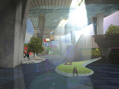
Via BDonline, a new town center plan for Croydon, London UK, design by Will Alsop: “…plans to replace Croydon’s reviled concrete look with a remodelled town centre including a 30-storey version of Cornwall’s Eden Project, an “emerald necklace” of parks, squares and a remodelled flyover and the restoration of the river Wandle 40 years after it was buried in culverts.”

:: image via BDonline
And I don’t really know what is up with the building facade – but it is compelling… ok, maybe just strange?

:: image via BDonline
Visually interesting, the renderings for 3XN‘s ‘Buen’ Cultural Housing in Mandel, Norway – via Architecture.MNP: “The project is described by 3XN as ‘a green blanket that elevates and makes room for the cultural center, and thus integrates it in the surrounding landscape”.

:: image via Architecture.MNP
The swooping vegetated rooftop form provides usable space without compromising views: “The undulating roof of the cultural center appears as a rolling hill, sloping upwards from the landscape – giving residents and visitors a usable, central outdoor space on the waterfront. This allows for the the center to occupy the land right on the water, without blocking access to the views and waterfront pedestrian experience.”

:: images via Architecture.MNP
Oft-published, the images of Antilla, by Perkins + Will, a 24-story corporate tower in Mumbai. Where to start with this one? First, it is named after a mythical island in the Atlantic. Second, it is built for a billionaire. Third, well, it’s pretty green.
In addition to this, there is the concept of Vaastu: “Similar to Feng Shui, the practice orients a building in harmony with energy flows. At Antilia, the overall plan is based on the square, which is Vaastu’s basic geometric unit, and a garden level occupies the tower’s midsection, the point where all energies converge according to the Vaastu Purusha Mandala.”

:: image via Architectural Record
A significant feature of the facade, obviously, is the vegetated forms. A description of the approach, quoting P+W design Principal – Ralph Johnson, from Architectural Record:
“Among its interesting elements, Antilia will feature a band of vertical and horizontal gardens that demarcates the tower’s different program elements. A garden level will separate the ground-floor parking and conference center from residential space above, for instance, and the outer walls on certain levels will be sheltered by trellises supporting panels that contain hydroponically grown plants.
“In addition to signaling different space uses and providing privacy, these “vertical gardens” will help shade the building and reduce the urban heat island effect. “You can use the whole wall almost like a tree and increase the green area of the site by five or 10 times over what it would be if you just did a green roof,” Johnson observers. “It’s a prototype for buildings of the future.”
:: image via Architectural Record
A more modest (and local example) from Seattle. Dwell featured ‘Chrome Below, Green Above‘ and a garage-scaled green roof project by architect Rob Harrison.

:: image via Dwell
The final project falls into the artificial and kitsch: Guy Hohmann‘s work Harmony, is a bench made of ash, plywood, polystyrene, and everyone’s favorite, artificial turf.

:: image via MoCo Loco
