These images on MoCo Loco’s Art MoCo featuring the work of artist Denny McCoy’s simple yet somehow deep paintings of colored bands, jogged my memory of a couple of recent color-related resources that floated by recently. Part photoshop swatch, part Timbuk2 messenger bag – it’s not the composition, but the complement of shades and tones that give this work resonance.
:: Rural Free Delivery – image via MoCo Loco
:: Cypress Creek – image via MoCo Loco
Maybe it’s because plants come with so many built in choices, or that we fear the power of color, but often this is an overlooked and powerful design element to and landscape composition. The psychological effects of color on the psyche is oft-mentioned and probably more oft-misapplied due to generalization, but at least the effort is there. How can this be applied in a meaningful way to design? I’ve always relied on my slim copy of Johannes Itten’s wonderful book ‘The Elements of Color’ , a text for 100-level University Art, for the basics. I still reference often today.

:: image via Amazon
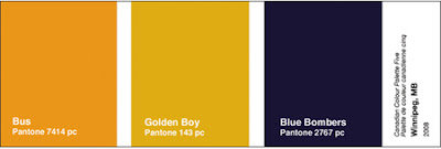
A couple of recent reports expanded the idea of color-related preferences, and their applicability to landscape architecture and urban design. A fascinating study of Canadian cities and ‘Local Color’ from Brand Avenue – taken from a recent article in The Walrus, where Todd Falkowsky’s is described: “I began by taking scores of photographs and employed computer software to pull out the predominant colours of Ottawa and the provincial and territorial capitals. The exact process that worked in Toronto did not necessarily work elsewhere — there is also an intuitive element to it. For each city, I had to centre on what makes it unique, such as prominent landmarks or distinctive features of its built environment. As a result, regional differences emerge: the North tends to be very bright, the Maritimes aquatic, Ottawa pale.”
See swatch samples from Winnipeg, Victoria, and Quebec City below. What colors would your city be?

:: images via Brand Avenue
Treehugger profiled a study by Getty Images MAP study ‘Aspirational Environmentalism’ that studies imagery and shows the trend of environmentalism away from stereotypical representations and ‘propoganda’ into a more expansive message. One that will typically eschew the color green – due to the direct connotation with the environmental movement.

:: image via Treehugger
I wonder how this will affect architecture and design, as green becomes a stigmatic hue – will vegetation on buildings become a problem versus a value-added?
Color theory is more vital due to the prevalence of digital rendering software in our field. These tools offer some great resources for determining color palettes for both representation and design. A colleague at work found Kuler, from Adobe Labs. A shared resource where designers can develop, save and sift through others color combinations. Here’s the swatches from the ‘Orange on Olive’, one of the combos featured, amongst hundreds.

:: images via Kuler
The site also offers a number of additional color-related resources. One favorite I found was ‘In the Mod: Color Analytics’ – which provides Photoshop swatches of famous modern artworks. Once a palette is chosen, other palettes of similar paintings by other artists – a way of noticing some similarities, and I was frankly surprised by some of the similarities.
Color, as I mentioned, is a powerful tool. Architecture spans monochromatic to highly varied colors in both interiors and exteriors. Landscapes offer, through plants, soil, water and sky – any hue imaginable in our imagination. Collectively, these become powerful materials and options at our disposal as designers. Like all other materials we utilize, we must continue to study, learn, evolve our thinking to capture the potential of this simple yet powerful tool.


