Everyone is publishing their best of 2007 blogs, and there are a number of interesting items of note. The amount of imagery showing buildings and landscape integrated was notable. My current interest is in seeing how many of these ‘green’ roofs and facades are actually feasible – and how many are merely the ‘green mantle’ just applied to a building as a inert material.
Modest examples from the Brad Pitt led competetion for housing in New Orleans… with open screen panels and vegetation, to the simple base treatment of pier footings including:

:: Design by James Timberlake, photo from Treehugger

:: Design by Shegiru Ban, photo from Treehugger
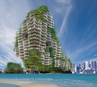
To acheive the next stage of greening, there is the abstraction from simple form to more robust unbuilt examples that require some significant work to realize. The first, by Edouard Francois, is entitled Eden Bio, and literally engulfs the structure in vegetative cover. I am personally a big fan, and loved some of the previous work, such as the TowerFlower in Paris, but must be skeptical of anyone whose face occupies a large portion of their website.

:: Design by Edouard Francois, photo from Dezeen
Next we move on to what BLDGBLOG described as ‘literal green architecture’ from SCIFI and architect Minsuk Cho… for a speculative building in Seoul, South Korea. This was my first introduction to Jeffery Inaba, whose interview with BLDGBLOG entitled ‘of cars, dogs, golf and bad feng shui ‘ is a must read:

Our short tour ends with the notable non-building example. Still, it is a significant example of literal greenwashing… in the form of a mountain in China that was painted green. The reasons for doing this ranged from response to degraded environments do to increase logging and subsequent erosion, to improving the town’s feng shui. Perhaps the $60,000 would have been better spent on actual green plants?
It’s over-the-top, but still a poignant example of the disregard for the actuality of vegetation as an material, whether natural or architectural. To portray landscape on par with horizontal and vertical panels of abstract material forgets the fact that there is pragmatism and reality to these types of application. This is not to say that they are not possible and that examples do not exist for precendents (such as the Renzo Piano designed California Academy of Sciences building and it’s undulating green roof, or some recent living walls posted here). There is the excitement and use that is vital to continual innovation and adoption of landscape integration, but also the failure potential and logistics that will be required by landscape professionals to pull them off. Take into account maintenance, and it’s definitely a large issue – but also a wonderful opportunity. Time for LAs to step up to the challenge – it’s going to be a green, green year.


